Case studies 1: dipping into the data

Over the last few months, the Englaid researchers have been beginning the process of engaging critically with the mass of evidence we have brought together for case study areas. One outcome has been the production of case study evidence summary sheets – a useful way of considering and collating key qualities of the different evidence types available for these areas. For some case study areas (for instance in Cornwall and the East of England) we’ve also been liaising closely with local researchers so that we can try to link our own investigations into local research programmes – building on or making connections with existing, ongoing and imminent projects.

Unsurprisingly, now that we’ve started engaging in earnest with the vast body of data we’ve assembled, we’ve had some interesting discussions about how to integrate and also how to fulfill the research potential of the various evidence sets. This is obviously much more of an issue in case study areas where we will be viewing and analysing evidence at a site level, rather than through the coarser lens of 1km squares. For instance we’ve been thinking through methods of refining or cleaning data and also of enhancing it in various ways. We’ve also been considering at what level/scale ‘cleaned’ data becomes analytically visible or relevant (more to come on this …).

From this point onwards we’re hoping to provide regular updates on the blog regarding how we’re getting on with the case study analysis. For now, it’s worth mentioning that our initial rummaging about with the evidence from case study areas, has generated a slightly revised case study map (which Chris Green has kindly visualized for us).

Chris Green and I also thought we’d have a play about with how to produce ‘snapshots’ of the case study evidence using the text from the data summary sheets and medium of tag clouds (http://www.wordle.net/create).

Northumbria evidence summary sheet tagcloud
Cumbria evidence summary sheet tagcloud
Marches evidence summary sheet tagcloud

Overall, we quite like the outcomes, especially once you start refining the tag clouds – grouping words into phrases like ‘watching brief’, removing the name of the case study area, and removing generic words like ‘archaeology’, ‘archaeological’, ‘site’, ‘report’ etc. (which I only did for the Isle of Wight and obviously you could fiddle about with this some more!).

Isle of Wight evidence summary sheet tagcloud

Isle of Wight evidence summary tagcloud (‘cleaned’)

The way in which geological information, the names of key sites and local researchers, evidence types, the structure of the documents themselves (headings and subheadings), and even the names of places which have strong research links with the case study area (in the case of the Isle of Wight, Oxford) become (more or less) evident and are juxtaposed is interesting. We also think that they work well as pithy reminders of some of the key traits of the case study areas.

Extracting trends (III)

Following again on from my previous two posts (1)(2), I have been experimenting further with constructing trend surfaces, this time for specific sub-sets of my downloaded AIP data for evaluations and post-determination / research results from 1990 to 2010.

First, I removed all of the data for investigations that had no results in terms of dated features, which results in a very similar trend surface to that for all of the data including investigations with no substantive positive evidence:

1 AIP_trend_noNegEvid
12th power trend surface for AIP data (excluding investigations with no positive results)

Then I constructed trend surfaces for the same data but filtered down to investigations producing results for each of EngLaId’s four main broad time periods:

2 AIP_trend_BA
12th power trend surface for AIP data (Bronze Age)
3 AIP_trend_IA
12th power trend surface for AIP data (Iron Age)
4 AIP_trend_RO
12th power trend surface for AIP data (Roman)
5 AIP_trend_EM
12th power trend surface for AIP data (early medieval)

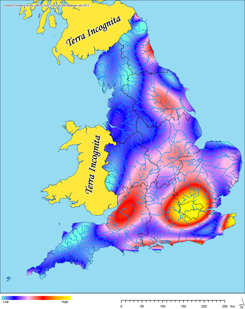
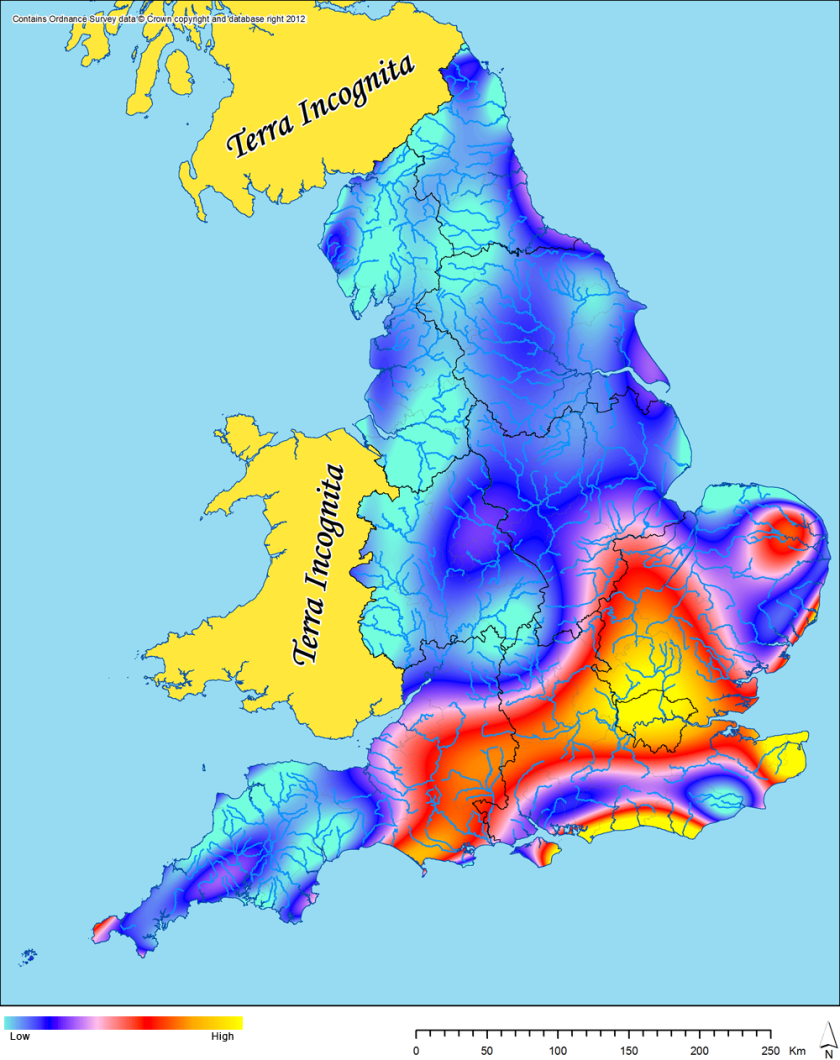
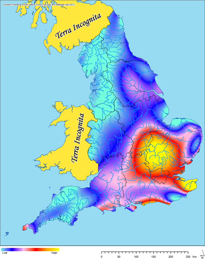
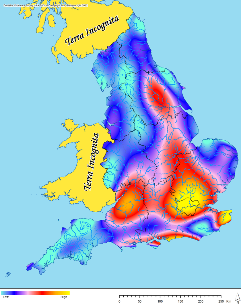
These results all look quite interesting to me, especially as they all vary quite significantly from the overall trend for all periods (albeit this is less the case for the Roman data).  The Bronze Age data shows a very clear bias towards an arc across south-eastern England from Dorset through to Kent and up into parts of East Anglia (the dry bits essentially), with the exception of the South Downs and the Weald.  The Iron Age is very strongly biased towards the counties north of London up to Cambridgeshire, across to north-east Kent and along the south coast.  There is also more of a northern trend than in the Bronze Age, with quite a significant peak in East Yorkshire.  The Roman data is distinctly biased towards London, Kent, the south coast, East Yorkshire and the Severn estuary region.  There is a surprising lack of any significant peak in the Tyneside area, considering the significant peak there in the data for all periods and the presence of Hadrian’s Wall.  For the early medieval, there is a very clear bias towards eastern England around the Fens and towards Kent.

I particularly like these results as they largely differ so significantly from the overall trend for all periods, which suggests that these patterns are more likely to be due to genuine distributions of underlying archaeological data, not just due to patterns of modern fieldwork (albeit this will still remain a very significant factor).  I am not sure any of the results are particularly surprising, interpretively, but they do confirm for me that we can extract spatial patterning from AIP data that is not just wholly biased towards areas of significant modern development.

Chris Green

Extracting trends (II)

Following on from my previous post about trend surfaces, I have now completed my proposed next step in extracting trends from the PAS data, by creating trend surfaces for the finds associated with each of our broad time periods.  To begin, here is a reminder of the trend surface for all PAS data:

1 PAS_trend_all
12th power trend surface for PAS data (all periods)

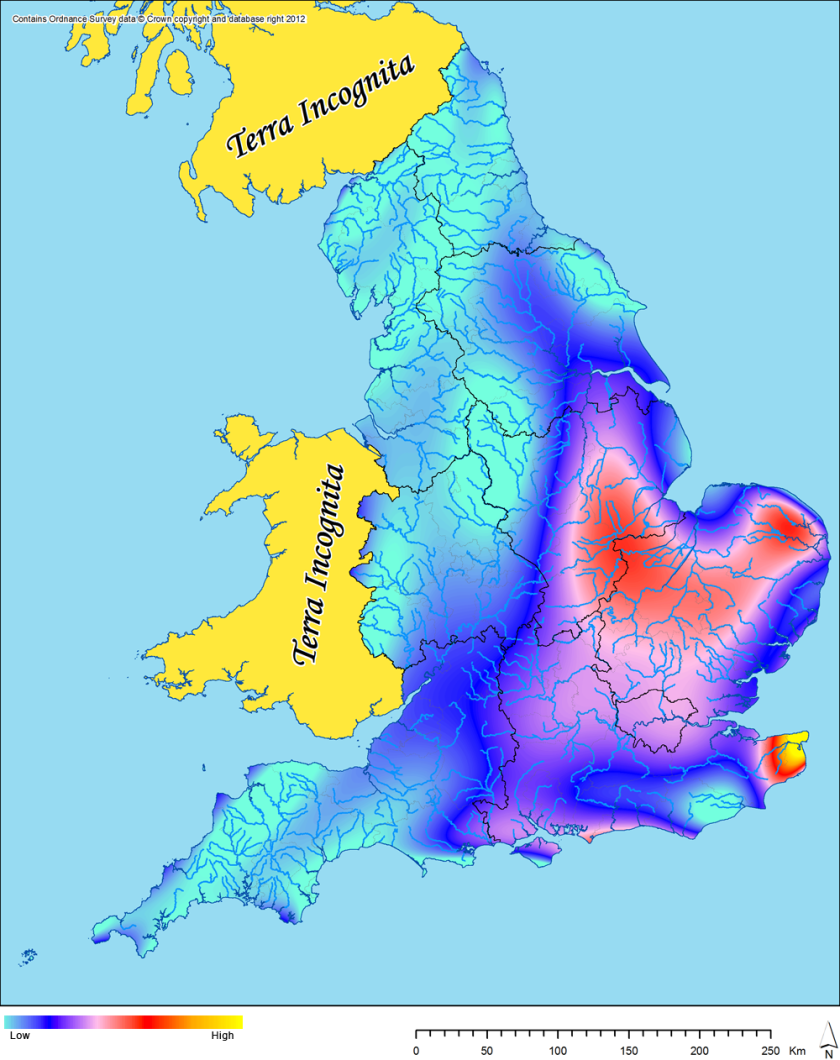
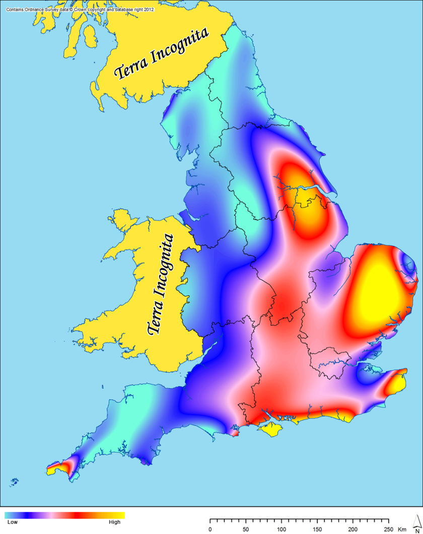
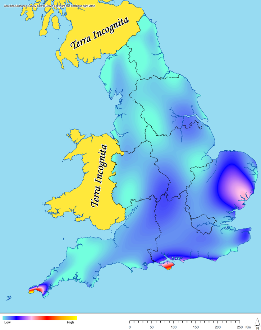
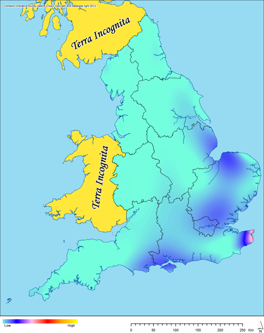
Now by period:

2 PAS_trend_BA
12th power trend surface for PAS data (Bronze Age)
3 PAS_trend_IA
12th power trend surface for PAS data (Iron Age)
4 PAS_trend_RO
12th power trend surface for PAS data (Roman)
5 PAS_trend_EM
12th power trend surface for PAS data (early medieval)

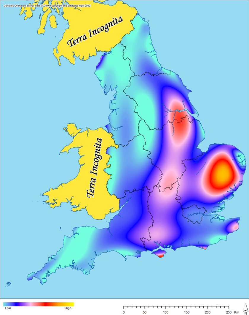
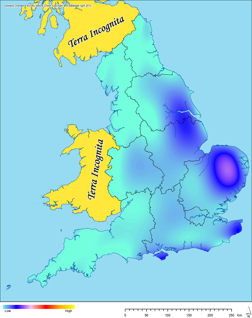
Although these should all be treated as very rough models, certain things do stand out.  For the Bronze Age, it is obvious that the main peaks seem to be occurring in the far west of Cornwall, the Isle of Wight and Suffolk.  In the Iron Age, the peaks are low, but I do think I can perhaps see the main areas of circulation for coinage showing up in the blue tones.  The Roman picture largely replicates the pattern for all periods (which is unsurprising as Roman finds make up a large proportion of the PAS database), but with a notable lack of finds in the west country.  For the early medieval, the peaks seem to be around the east and south-east coast.

To stretch interpretation perhaps beyond where I should, I might suggest that the fact that the peaks in the Roman and early medieval period are in similar locations to the overall dataset suggests that the dominant attribute governing where finds of these date are found would be where metal detecting activity is most popular (of course, this is partly self-fulfilling, as people are bound to find metal detecting more appealing in areas with lots of metalwork in the soil).  However, the fact that the peaks in the prehistoric periods are somewhat differently located suggests to me that patterns in the these data are more likely to be genuine representations of past behaviour.  Perhaps?

Chris Green

NB:  Scotland and Wales are marked as terra incognita on my maps as they are outside of EngLaId’s spatial remit.

Extracting trends

One particularly major modern bias that exists in the datasets being studied by EngLaId is that of where archaeological activity tends to take place in England.  In particular, commercial archaeology tends to take place more commonly in areas where more modern development takes place (especially relevant to our AIP and HER datasets) and also there are obvious biases in the PAS towards areas which are more popular with metal detectorists /  have better conditions for metal detecting / where Finds Liaison Officers are more well-established.

It is necessary to somehow quantify these biases, so that it can be discerned whether patterns discovered are more likely to be a true reflection of past activity or more likely to be an artifact of modern archaeological activity.  Amongst others, Andrew Bevan has done some very interesting work in this area using kernel density estimates (Bevan 2012), but I have my own bias towards a slightly different approach: trend surface modelling.

The trend surface is, essentially, an attempt to model underlying trends in a point based dataset based upon numerical values attached to those points.  The algorithm creates a polynomial surface which tries to reflect that trend.  It is then possible to use that surface to test whether individual points within the original data either fall above or below the expected value (bucking the trend), or fall more close to the trend itself.  This would then require explanation.  The first step, however, is creating the trend surface.

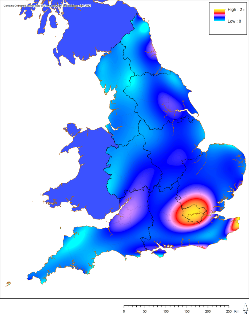
As a measure of where commercial archaeological interventions have taken place since the onset of PPG16 in 1990, I first extracted AIP data for each county of England via their website, restricting my query to the years 1990 to 2010 and to field evaluations and post-determination / non-planning events.  These spreadsheets were converted, combined, and imported into ArcGIS using my script.  The resulting points were then counted per 1 x 1 km grid cell and a 12th order (the most complex surface available in ArcGIS) trend surface created:

trend_AIP
12th order polynomial linear trend surface for field evaluations and post-determination / non-planning events for 1990 to 2010 recorded by the AIP.

Essentially, this map then shows the expected amount of interventions per square kilometre across England.  Although the values are small (0-2+), the pattern looks convincing to me, with obvious peaks in London, Kent, the eastern south coast, the Bristol region, South / East Yorkshire and Tyneside.  There are also clear troughs across most upland regions of England.  It is particularly obvious how much commercial archaeological work has taken place in London over the past twenty years.

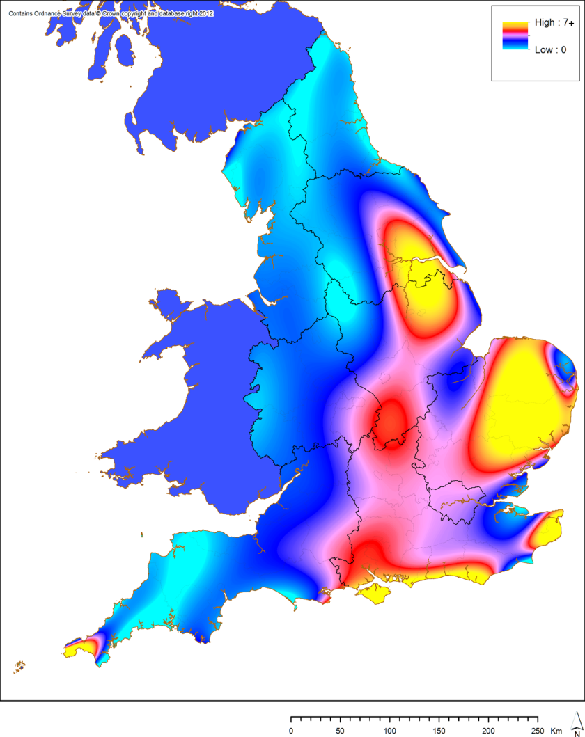
I then repeated this task for the PAS data for all time periods (as of August 2012):

trend_PAS
12th order polynomial linear trend surface for all PAS finds up to August 2012.

Again, this map shows the expected number of finds per square kilometre across England.  Here we see obvious peaks in East Anglia, Kent, the eastern South coast and the Isle of Wight, western Cornwall, Northamptonshire, and Humberside / Lincolnshire.  Again, there are obvious troughs across the uplands of England and also in some areas of dense settlement (Tyneside, Essex, Medway).  As stated above, there are several factors at play here, but the pattern seems a convincing and useful one to my eyes.

The next stage for the PAS data would be to construct further trend surfaces for each of our time periods and see how these compare against the overall trend across all periods.  In this way, it ought to be possible to pick out areas for further study which show particular peaks within a single time period that are not present in the overall trend.  Whether this works, only time will tell!

Chris Green

References:

Bevan, A. 2012. “Spatial methods for analysing large-scale artefact inventories.”  Antiquity 86, pp. 492-506.