Cartography and Quantum Theory: in Defence of Distribution Mapping

This post is the text and images from a book chapter that I have recently had published. The published version has had the images converted to black and white, so I thought I’d post the proper version here, as I still hold the copyright for the chapter and it works better with colour imagery. This is the bibliographic reference if you want to cite me or find the rest of the book, which is a very interesting read indeed (no claims made of the same for what follows!):

Green, C. 2019. “Cartography and Quantum Theory: in defence of distribution mapping.” In: M. Gillings, P. Hacigüzeller, G. Lock (eds.) Re-mapping Archaeology: Critical Perspectives, Alternative Mappings. Abingdon: Routledge, 281-299. ISBN: 978-1-138-57713-8

Endnotes have been included after the paragraph in which they are referenced, rather than at the end of the text.


13 Cartography and Quantum Theory
In Defence of Distribution Mapping
Christopher Green

Distribution Mapping in Archaeology: a Perceived Problem

This paper was written whilst working on the English Landscapes and Identities Project (EngLaId) at the University of Oxford. During my time working on EngLaId, I have been confronted with two things: my own improvement as a cartographer (by which I mean a maker of maps) over a substantial period of my life (see below); and how to gestate years of experience into guidelines for the somewhat less practiced members of the project team, employed to work with GIS and maps on an almost daily basis but mostly with little formal cartographic training. Alongside the rest of the project team, I have also spent a great deal of time pondering how to present the extremely complex and characterful data  of the project to academic and public audiences (Green 2013; Cooper & Green 2016): the main EngLaId database contains over 900,000 records of English archaeological remains from the Middle Bronze Age (c.1500BC) to the end of the early medieval period (c.AD1000), including an almost unquantifiable large element of duplication due to its origin in a multiplicity of source datasets. Turning this complexity into a series of comprehensible messages is a difficult task (Green et al. 2017).

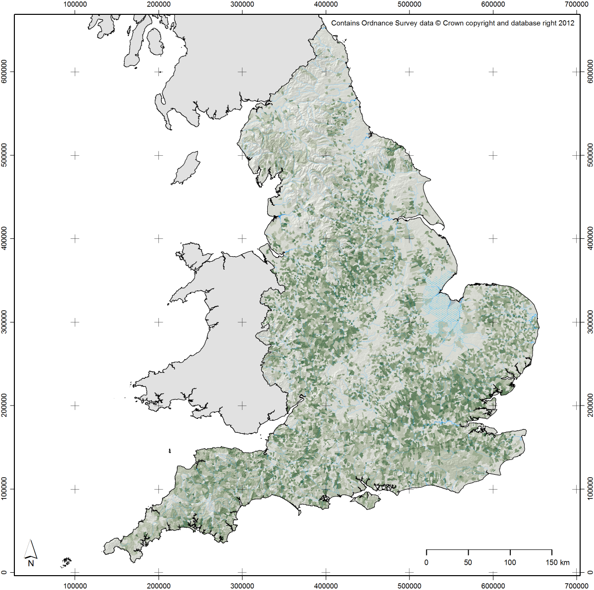
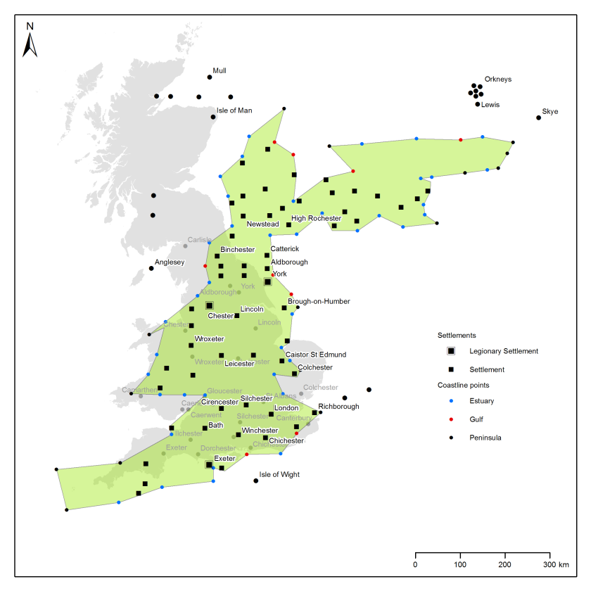
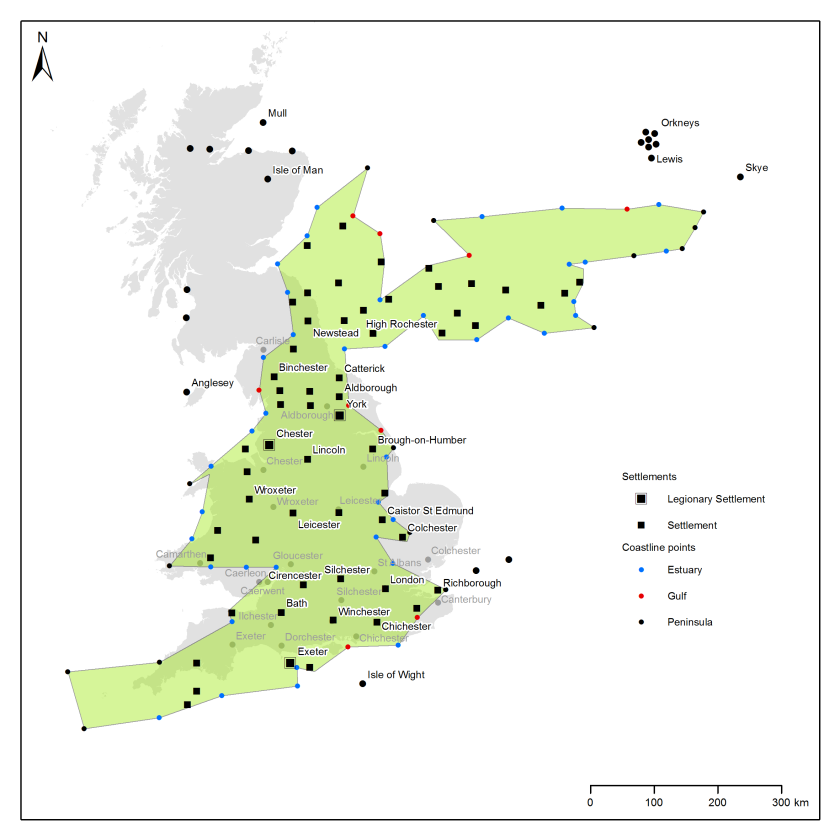
If we ignore a childhood spent doodling maps of imagined lands, my first real experience of formal cartography came as an undergraduate archaeology student at the University of Durham. As I would imagine is the case with many archaeologists (and indeed many geographers), I first encountered GIS as a map making tool (obviously it is also much more, but this paper only considers the cartographic aspects of GIS) as part of a course on computers and computing in archaeology. I recall little formal teaching on good map design, and maps that I subsequently made for my dissertation, which was an attempt to construct a “mental geography” of Roman Britain, show a considerable cartographic naivety (Figure 13.1): amongst several errors, note the excessively large north arrow and the use of a fractional scale for a map which would inevitably be resized in the final document (thus making the scale incorrect, as it also is here).

Fig_1

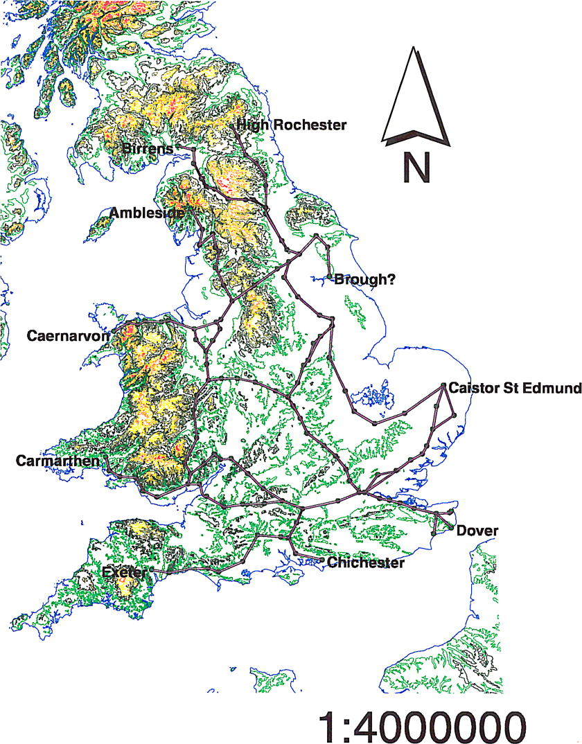
Fig. 13.1: Map created by the author in 1999 as part of his undergraduate dissertation. The lines depict routes in the Antonine Itinerary (after Rivet & Smith 1979).

This, then, is the situation in which many archaeologists find themselves: forced to make maps as part of their projects or employment, but with little expertise in what we might call good cartographic practice and with little opportunity to learn other than through trial, error, and repeated effort, especially in the academic sector (more structured training and formal cartographic guidelines may be provided in the commercial sector – Victoria Donnelly, pers. comm.). One consequence of this is the mistaken orthodoxy of certain prescribed practices, such as “a map should always have a scale bar” (Wood 2003: 7): many commonly used map projections (including the still very widely used modern derivatives of Mercator) do not preserve distances and so adding a scale bar to a map of large areas of Earth created in such a projection is simply incorrect (as measured distance will vary across the map) (Figure 13.2).

Fig_2

Fig. 13.2: Map of the world rendered in the very commonly used “WGS84” projection setting in ArcMap. Thick black lines are of 1000km length illustrating the incorrectness of adding a scale bar to such a map (or at least just a single one). Contains data derived from the GADM Database of Administrative Areas (http://www.gadm.org/).

Another consequence of cartographic naivety is the widely heard verbal (albeit rare in print) complaint that mapping distributions is “just putting dots on maps”. Although it may often be correct to say that dots can be a poor way of representing extended areas of past settlement (Evans 2000: 3), that is essentially a question of the scale at which one works. Scale is, in fact, key herein and we shall return to the issue later. One form of distribution mapping for which complaints of being “just dots on maps” are somewhat justifiable are the very common phenomenon of “sites referred to in the text” (another mistaken orthodoxy), at least where no spatial context is given beyond a coastline and perhaps major rivers. Without sufficient context (an issue we shall return to below), such maps are largely without merit, as they will be of little practical use to readers who do not already possess a strong knowledge of the geography of the area mapped: a gazetteer with grid references would be far more useful if a reader wished to subject results to further data analysis. At the very least, a distribution of all sites of the same type should be included, rather than simply those chosen by the author to write about: without that, any conclusions drawn by a reader (or the author) regarding the distribution of the sites discussed will be entirely meaningless.

In part, criticism of distribution mapping arises out of the wider phenomenon of postmodern critique, specifically seen in archaeology in the tension between so-called phenomenological and Cartesian approaches (Sturt 2006: 121): maps are seen as a tool of positivism, providing a restricting and classificatory top-down perspective at odds with lived experience on the ground in the real world. Yet the recovery of lived experience of the past is an impossible dream. Crampton states that there is, to the postmodern eye, something unseemly about maps (2010: 6):

“These wretched unreconstructed things seem to work so unreasonably well! [original emphasis]”

Crampton accepts that maps enabled many abhorrent elements of the modern age, such as colonialism, racism, warfare, espionage, and that GIS is seen by some as a Trojan Horse for the return of positivism. Yet he states that this is not exclusively true of maps but also of many other things. Like the power of the atom, maps can be used for beneficial as well as unfortunate purposes (Crampton 2010: 6–7). Maps in and of themselves, then, are not part of the problem: how we use them and how we construct them are the real issues. Making a map involves an inevitable task of classification and simplification of real world phenomena, but this can as easily be approached as a subversive act as it can as an act designed to promote an imperialist (whether colonial or economic) agenda.

Map Making in a Digital World

Through the 20th and early 21st centuries, the practice of making maps (alongside GIS generally) became increasingly divorced from both geography and cartography as academic subjects, to the extent that people who never made maps (e.g. lecturers) could claim to be cartographers (Crampton 2010: 2). Conversely, it is now possible for any person with a computer and access to the internet to make a map: cartography as a practice has opened up to the public and escaped from its academic confines, aided by practices such as “map hacking” and “mash-ups” (Gartner 2009) and software such as Google Earth (Collins 2013). However, this democratisation is highly dependent upon access to computers and information technology expertise (Crampton & Krygier 2006: 12, 18–19; Field & Demaj 2012: 70). Today, the use of maps and spatial technologies has never been more common and more widespread (Crampton 2010: 11), immanent in the continually strengthening “geo-lifestyle” revolution (Field 2009: 59).

Some celebrate what they see as the death of cartography as an academic subject (see Wood 2003 for a wonderful polemic on the question), although as a practice it has never been healthier (Crampton 2010: 24). Academic journals on the subject and on GIS more widely are now largely dominated by technical issues rather than the aesthetic or the political (Crampton 2010: 5), whereas the people actually making maps have changed, now including data artists, journalists, and coders. Non-cartographers have always made fine maps from time to time (e.g. Harry Beck’s Tube map, Charles Minard’s map of the advance of Napoleon into Russia [Figure 13.3], or John Snow’s epidemiological map of cholera in London), but the world is now awash with maps made by untrained map makers (Field 2015: 93). This should be seen in a positive light, with cartography as a practice slipping from control of the elites who have dominated it for centuries (Crampton 2010: 40) in what Field drolly calls (2014: 1):

“…a cacophony of cartography… a harsh, often discordant mixture of the weird and the wonderful.”

Fig_3

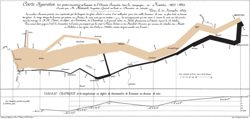
Fig. 13.3: Charles Minard’s 1869 map of Napoleon’s Russian campaign of 1812–3, showing the successive losses of soldiers along the route. This is a public domain image obtained via Wikimedia Commons (https://commons.wikimedia.org/wiki/File:Minard.png).

The reaction within the academic fields of cartography and GIS to democratisation of cartographic practice has been less positive in many cases. Professions with power organise and force through legislation to protect their positions (e.g. law or medicine), whereas weaker professions create certification criteria and denigrate the output of non-professional rivals (Wood 2003: 5). Cartography and GIS fall into the latter category, as seen in the existence of the GIS Certification Institute in the USA (Crampton 2010: 36). This rather parallels the role of the Chartered Institute for Archaeologists[1] (CIfA) in British archaeology: like archaeologists, any person can now claim to be a cartographer, which some find discomfiting. Systems of ethics (Dent et al. 2009) and guidelines (Southworth & Southworth 1982) for “good” map design exist (MacEachren 1995; Monmonier 1996; also Tufte 2001 for data visualisation more widely), but are largely ignored by untrained makers of maps, causing professional cartographers to call for a return to best practice (Field 2005; 2014; Kent 2005: 187).

[1] CIfA is a membership organisation which requires the provision of references and work samples to become an accredited member, and which involves members signing up to a code of conduct, etc. See: http://www.archaeologists.net/

To return to the example of my own career, from 2001 to 2002 I studied for an MSc in GIS within a geography department. There, I learned a great deal more about GIS and about making maps (including cartography taught as visualisation – Field 2005: 81). However, the great majority of my peers had been through the undergraduate geography degree and, as such, certain key concepts were not covered in a great deal of detail (particularly map projections). In 2005, I commenced a PhD looking at the representation of time in archaeological GIS (published as Green 2011). In the course of that piece of work, I made a great many more maps and my cartographic skills improved (Figure 13.4). However, I still made mistakes, albeit ones that might be less apparent at first glance: in Figure 13.4, note the division of the first four sections of the scale bar into 2.5km units (five 2km units would perhaps be more logical) and the spurious precision of the values in the legend. I also dislike the ArcMap default American spelling of “Kilometers”. Furthermore, it would have been better to extend the extent of the trend surface to the full bounds of the county so that there were no white areas within the boundary polygon.

Fig_4

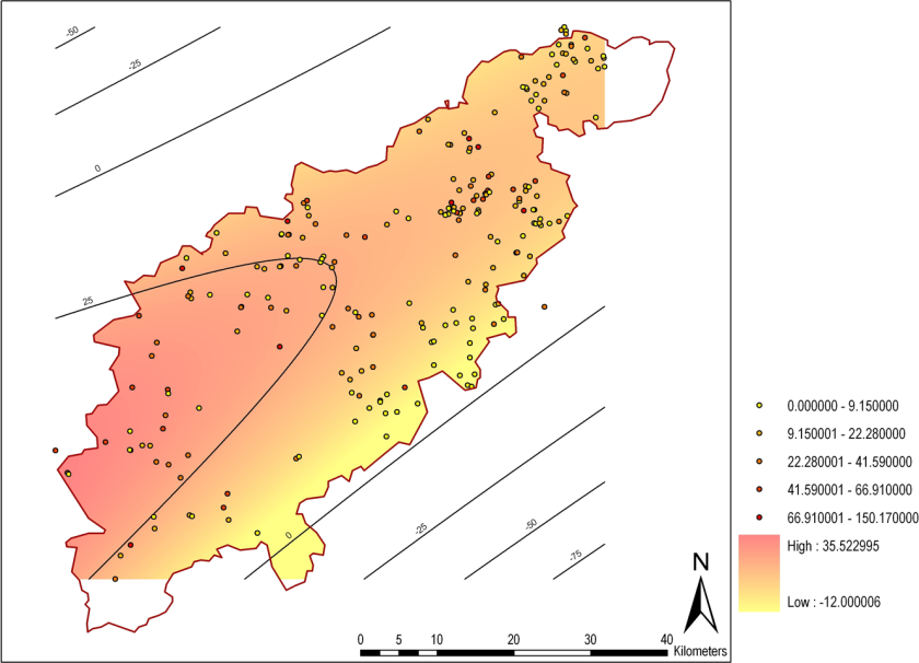
Fig. 13.4: Map created by the author in 2008 for his PhD thesis (later published as Green 2011). The trend surface shows a model of pottery deposition in Northamptonshire between AD115 and 240. This image contains data derived from Jeremy Taylor’s unpublished PhD thesis, originally gathered by David Hall.

The point of this autobiographical example is that even with training and practice, those engaged in map production may still make mistakes, which in some cases might confuse the message being communicated. They may sometimes only be obvious to experienced cartographers, but the key message here is that no map can ever be perfected to the taste of all audiences. Those without formal training in cartography might make more mistakes or produce maps that fail to please the cartographic profession, but their ability to produce new insights should be embraced. It is clearly not possible, nor probably desirable, to provide cartographic training to every person who now wishes to make a map, but some form of guidance is needed if people are to produce comprehensible output. For that guidance, we can find inspiration in what is perhaps an unlikely arena: quantum theory.

The Uncertainty Principle

The Uncertainty Principle, formulated by Heisenberg (1927), forms one of the foundational elements of the field of quantum mechanics. Hawking described its effects eloquently (2011: 62-63):

“In order to predict the future position and velocity of a particle, one has to be able to measure its present position and velocity accurately. The obvious way to do this is to shine light on the particle. Some of the waves of light will be scattered by the particle and this will indicate its position. However, one will not be able to determine the position of the particle more accurately than the distance between the wave crests of light, so one needs to use light of a short wavelength in order to measure the position of the particle precisely. Now… one cannot use an arbitrarily small amount of light; one has to use at least one quantum. This quantum will disturb the particle and change its velocity in a way that cannot be predicted. Moreover, the more accurately one measures the position, the shorter the wavelength of light that one needs and hence the higher the energy of a single quantum. So the velocity of the particle will be disturbed by a larger amount. In other words, the more accurately you try to measure the position of the particle, the less accurately you can measure its speed, and vice versa. Heisenberg showed that the uncertainty in the position of the particle times the uncertainty in its velocity can never be smaller than a certain quantity, which is known as Planck’s constant. Moreover, this limit does not depend on the way in which one tries to measure the position or velocity of the particle, or on the type of particle: Heisenberg’s uncertainty principle is a fundamental, inescapable property of the world.” [my emphasis]

The useful part of this for our purposes here is the idea that the greater the precision one can discover about one aspect of a particle’s state, the lesser the precision that one is able to discover about another (related) aspect of said particle’s state. This appears to be a fundamental property of the universe that we exist within. Whilst I would not propose the existence of a Planck’s constant for cartography, the idea that precision of measurement on one variable is related to precision of measurement in another variable can form a very useful metaphor for the untrained cartographer for estimating the level of detail that can be comprehensibly placed upon a map, with the “particle” being equivalent to any element placed on a map.[2]

[2] Incidentally, knowledge of Heisenberg has previously been suggested as a desirable trait for archaeologists, albeit as a metaphor for greater archaeological understanding of the natural sciences rather than anything specifically to do with Heisenberg’s work (Pollard 1995). One might also get a sense of the Uncertainty Principle in Olivier’s Cycles of Memory (2011: 190–194) and certainly in his uncertainty principle of the archaeological past, in which he states that it is impossible to know both the position of any moment of the past in time (i.e. its date) and its rate of transformation (i.e. its place in evolutionary history) (Olivier 2001: 69).

Using the Uncertainty Principle to Understand Archaeological Cartography

Time (usually as date or period), space (usually as place of discovery), and type (often as typological category) are fundamental to the nature of archaeological data. Time and type have been extensively theorised within archaeology, but space arguably less so, with most theoretical considerations of space in archaeology focusing on ontological questions (e.g. space as an a priori container) rather than epistemological ones. Key to the epistemological theorisation of space is spatial scale, with different past processes potentially discernable at different scales (Wheatley 2000: 123, 128; Lock & Molyneaux 2006b: 1; papers in Lock & Molyneaux 2006a, particularly Yarrow 2006).[3]

[3] The terms “large” and “small” are problematic when applied to spatial scale due to the differing conceptions of cartographers (who use “large” to mean a large representative fraction, e.g. 1:10,000, and “small” to mean a small representative fraction, e.g. 1:250,000) and most other people (who would expect a “large” scale analysis to cover a large amount of space, and vice versa) (Lock & Molyneaux 2006b: 5). As such, herein I will use the terms “narrow” to refer to spatial scales that cover smaller amounts of space in higher detail and “broad” to refer to spatial scales that cover larger amounts of space at lower detail.

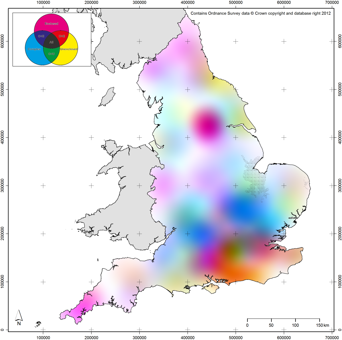
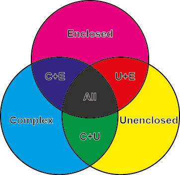
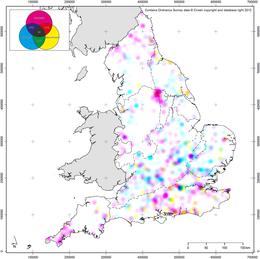
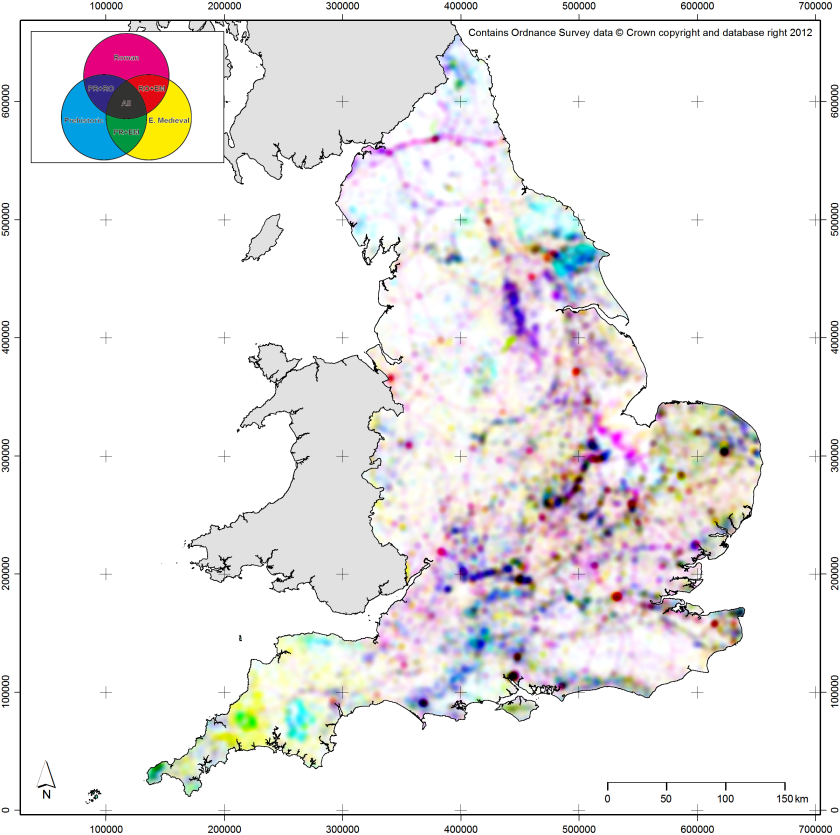
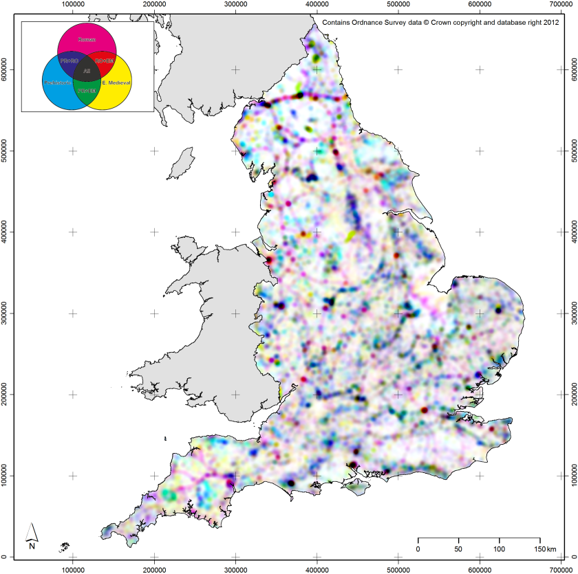
Spatial scale is one of the attributes of archaeological data that we can approach using map production methods inspired by the Uncertainty Principle. For spatial scale, its linked attribute is spatial resolution: the size of the objects used on a map to represent the archaeological data, whether they be dots or spatial bins (see Green 2013 for more discussion on the latter). When working at broad scales, dots placed on a map will often cover many square kilometres of space and, as such, spatial precision matters less. As one moves in to narrower spatial scales, spatial precision becomes more important and the spatial resolution of the objects should become finer. To give examples from within the context of EngLaId (Figure 13.5a–b), at our broadest spatial scales (all of England as a small printed image) the most appropriate forms for mapping distributions would be interpolated surfaces such as Kernel Density Estimates (KDE) (O’Sullivan & Unwin 2010: 68–71) or trend surfaces (O’Sullivan & Unwin 2010: 278–287), as these operate at coarse spatial resolutions where patterns remain visible that would be obscured or invisible if raw data was mapped (see Green et al. 2017). As our spatial scale narrows, we would move on to using various resolutions of aggregated spatial bins (Green 2013). Finally, at very narrow spatial scales, we would use the raw data directly exported from our database.

Fig_5

Fig. 13.5: Examples of maps from towards each extreme position; (a) broader scale, coarser resolution; (b) narrower scale, finer resolution; (c) coarser temporal precision, higher typological precision; (d) higher temporal precision, coarser typological precision.

The second set of linked attributes of archaeological data that can be conceptualised using the Uncertainty Principle as a metaphor are time and type. Time in archaeology can be represented at a range of precisions from the complex probabilities of scientific dates (e.g. probabilities output from software like OxCal; Bronk Ramsey 1994) through to very coarse broad time periods (e.g. Iron Age, Bronze Age, etc.). Equally, type of object (whether a site, an artefact, an ecofact, etc.) can be represented at a range of categorical precisions from the broad (e.g. defensive monument) through to the more specific (e.g. bivallate hillfort, or conceptually even a single specific site). Clearly, as a database representation, it is possible to store and manipulate all of this detail for every record in a dataset. However, to attempt to represent the full complexity of our objects cartographically would be impossible (or, at least, incomprehensible). As such, these two attributes can again be conceived as related within the bounds of the Uncertainty Principle: when making a map, the greater the temporal precision of mapped objects, the lesser the typological precision or complexity that should be applied. To give further examples from within the context of EngLaId (Figure 13.5c–d), if we were to map objects using precise temporal probabilities for time-slices, then only objects of a single type or of grouped types could be plotted on a map. Conversely, if we wished to create a map which showed the full gamut of site types in our database, then we could only map objects of a single time period (or all time periods grouped together). The latter case would still produce a map that was too complex to be understood by a reader, but the point is conceptually sound.

Bringing this all together (Figure 13.6), the two sets of related properties are also subject to a similar precision dependency. Broad spatial scale, coarse spatial resolution maps can only articulate relatively simple time / type relationships. Conversely, when working at narrower spatial scales and finer spatial resolutions, then more subtle time / type relationships can be more easily expressed. When working with this model in practice, an archaeological cartographer should begin by considering the research question which their proposed map is attempting to explore and who their anticipated audience is. Audience is key, as the complexity of a map can be at its greatest for internal analytical usage (as we can assume a researcher will be very familiar with their own data) and its lowest for public-facing usage (where we can assume no familiarity).

Fig_6

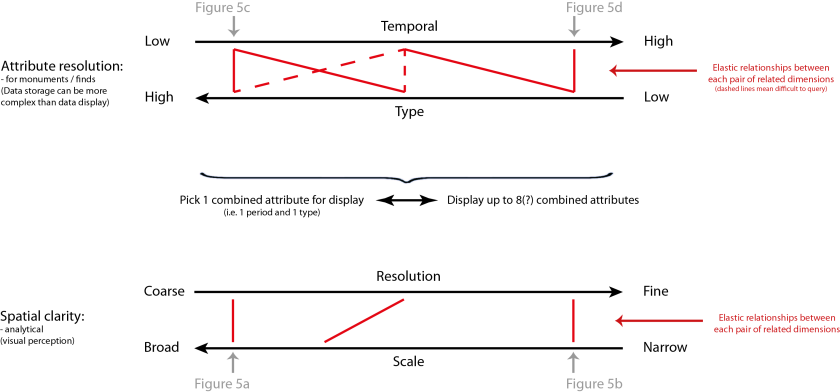
Fig. 13.6: Model depicting the application of the Uncertainty Principle to archaeological cartography.

Assuming a large dataset, if the research question requires very precise time and type, then it can only be answered at relatively narrow spatial scales and, as such, the researcher should start at the top of the model (in Figure 13.6) and work down. Conversely, if the research question requires working at broad spatial scales, then the researcher should start at the bottom of the model and work upwards. As a brief example, if one wished to make a five by five centimetre map of grave goods dating to between AD 50 and AD 100 in England, the resulting map would be best done as a density surface (due to the small image size) and could only feature the broad category of all grave goods, or alternatively one specific sub-category. In this way, when making a map of archaeological data, even an inexperienced cartographer ought to be able to ascertain a sense of what level of time / type complexity and what spatial scale / resolution they should be working at, through their metaphorical understanding of the Uncertainty Principle.

Providing Better Context for Distribution Mapping

As something of an aside and to move away from quantum theory, another key element of increasing the reputation of distribution mapping in archaeological circles lies in improving the contextual information provided to our maps’ audiences. It may be a cliché, but context is key to archaeological research, both on site and when zooming out to study broader areas of space. When mapping archaeological data regionally or nationally, it is important for cartographers to take account of the manner in which archaeological distributions are governed by patterns in fieldwork undertaken (Evans 2000: 3). This has become particularly important since the advent of developer funding of commercial archaeological fieldwork (in 1990 in Britain), as the location where the vast majority of investigations that take place since that time has been governed primarily by planning concerns rather than by archaeological research questions. This need not be conceived of as a problem to be corrected, but rather an element of the character of the data that should be studied and embraced (Cooper & Green 2016).

As such, it may be better to conceive of this relationship between fieldwork patterns and archaeological distributions using the concept of affordance. Introduced into archaeology via Ingold (1992), affordances are used within the discipline as a way of understanding the mutually constitutive relationship between people and their environment (Gillings 2007: 38–39). Essentially, the relationship between the archaeological record and patterns of development / fieldwork can be viewed in similar vein: practices in the modern world give rise to opportunities to analyse archaeological remains. Acquiring an understanding of this relationship is vital to understanding archaeological distributions today.

In order to enable quantitative analyses of this relationship, the EngLaId project constructed a model of modern affordances that have been affecting the structure of the archaeological record in England since 1990 (Figure 13.7) (for more on the structure of this model and the data built into it, see Green et al. 2017). This particular model reflects factors relating to excavation[4] and aerial photographic survey[5], currently the two most common sources for information that has entered the English archaeological record (LiDAR and geophysical survey are still only just starting to result in significant numbers of new “sites” in England, being mostly employed to study sites that were already known). We can use the model to test distributions of archaeological sites in an attempt to assess the extent to which they are influenced by modern fieldwork patterns or by more genuine patterns of past practice.[6] Contextualising our data in this way is vital if we wish to make our distribution mapping work better at communicating and explaining any patterns that we might discover, as the distributions we map are mostly no longer primarily structured by past practice (if they ever were). Modern affordances are just one example of better contextualisation, but they are a particularly key one. In combination with a more structured understanding (as discussed above) of the relationships between scale, resolution, time, and type, improving the contextual elements of archaeological maps can only make their messages more powerful.

Fig_7

Fig. 13.7: Model of modern affordances affecting the structure of archaeological distributions in England. This image contains modified data originally derived from: Historic England NRHE Excavation Index (hosted at: http://archaeologydataservice.ac.uk/archives/view/304/); Centre for Ecology & Hydrology’s Land Cover Map 2007 (hosted at: http://doi.org/10.5285/2ab0b6d8-6558-46cf-9cf0-1e46b3587f13); NSRI National Soil Map of England and Wales (hosted at: http://www.landis.org.uk/data/natmap.cfm).

[4] Planning data was impossible to collate, so excavation affordances were modeled using the density of previous excavations from 1990 to 2010, including excavations with negative results and those that found material of any time period (to minimize bias introduced by focusing on specific periods).

[5] Factors affecting aerial photographic survey were modern land use (arable representing crop mark potential; pasture representing earthwork or parch mark potential) and obscuration of the ground surface, whether by above ground structures / water bodies / woodland or below ground masking superficial geologies / soil types.

[6] For example, hillforts score low on this model, as they tend to be in areas where opportunities to find archaeological material are low but being large and obvious monuments they tend to be easy to discover despite that. A monument category like Anglo-Saxon sunken featured buildings (also known as Grubenhäuser) score much more highly on the model, as they are less obvious and thus require greater levels of opportunity to be discovered.

Conclusions: Making Better Archaeological Maps?

To return one final time to my autobiographical examples, since 2011 I have been employed on the EngLaId project as a postdoctoral researcher in GIS. As a result, I have spent many hours making many different maps of many different datasets. I have regularly made maps for my own purposes, for other project members, and for other people working within our department. As a result, my skills as a cartographer have improved immensely, to the extent that I often feel quite a strong sense of pride over the maps that I produce (e.g. Figure 13.8). Distilling that experience into a model of good cartographic practice for my own purposes and for the help of others has resulted in this paper.

Fig_8

Fig. 13.8: Map created by the author in 2016. Darker green shading depicts greater levels of woodland cover in the eleventh century AD (after Roberts & Wrathmell 2000: figure 24), collated by post-medieval parishes (Burton et al. 2002). This image contains data derived from Sturt et al. 2013 (the former sea levels around The Wash).

Generally speaking, in my work I start with the question of scale and move upwards through the model outlined above, considering resolution next to maximise the legibility of the map produced. For example, although there are statistical methods for determining the appropriate kernel size for a KDE surface (e.g. the Mean Integrated Squared Error; Marron & Wand 1992), making a choice based upon cartographic legibility seems more logical to me as that should always be a key concern when making any map. Visualization for the purposes of research (of which map making is but one strand amongst many) exists to save time during the processes of discovery and communication of information and knowledge (Chen et al. 2014), with “pleasantness” key to visual efficiency (Kent 2005: 184). As a specific technique, map design lies at the central point between art, science, and technology, with no single recipe for success (Field & Demaj 2012: 73–75). As such, cartographic concerns such as legibility (including taking account of colour blind audience members) and aesthetic appeal should be foremost in our minds when making maps. A metaphorical understanding of the Uncertainty Principle as outlined above can aid greatly in that task, providing guidance to aid the archaeological cartographer without dictating or attempting to control methods or outputs.

We make maps and use GIS in an attempt to make sense of the geographical world: they are as artistic and as political (Crampton 2010: 3, 12) as the world around us. They imperfectly reflect (or refract?) reality and should be embraced as such. Thus, we should not be anxious about cartography in and of itself, only anxious about approaching it uncritically (Crampton 2010: 184). Maps are no longer only useful for the increasingly moribund hypothesis testing / pattern confirmation practices of the old scientific method, but can be vital to modern exploratory data analysis / pattern seeking methodologies (Crampton & Krygier 2006: 24) as part of hybrid approaches to understanding the world / archaeology (Hacıgüzeller 2012: 257) through suggestion, not definition, of spatial patterning (Sturt 2006: 131).

Distribution mapping of archaeological material remains vital to the understanding and communication of the results of fieldwork and other investigations, giving a flavour of space and presenting an idea of the relationship between archaeological remains and local / regional topography (Sturt 2006: 131). Careful cartographic choices (e.g. using models such as that outlined above) and an understanding of context (including modern affordance patterns) are vital for achieving critical comprehension of our material in all of its wonderful character. Archaeologists are very rarely trained cartographers, but this should not be seen as a problem, more as an opportunity. Hopefully, the ideas outlined in this chapter will help guide those wishing to make maps of archaeological data down fruitful avenues, whereby effective communication is enabled through an understanding of the vital inherent relationships between scale / resolution and time / type. Finally, I will leave it up the reader to decide if I have improved as a cartographer since I made my first maps in the late 1990s, but I am certain that my creation of the model presented here has aided in whatever improvement I have achieved.

Acknowledgements

This paper was written whilst working on the English Landscapes and Identities Project (EngLaId) at the University of Oxford. EngLaId has been funded by the European Research Council (Grant Number 269797). My thanks go to the other members of the EngLaId team for providing a stimulating research environment without which this work would not have come to fruition. In particular, the ideas presented in this paper arose out of fruitful discussions with Anwen Cooper on the capacities of our evidence and how we can present it to the world. I would also thank Anwen Cooper, Miranda Creswell, Victoria Donnelly, Michaela Ecker, Letty ten Harkel, and Sarah Mallet for helpful feedback on draft versions of this paper, as well as the editors of this volume for the further useful advice.

Bibliography

Bronk Ramsey, C. (1994). Analysis of chronological information and radiocarbon calibration: the program OxCal. Archaeological Computing Newsletter, 41, 11–16.

Burton, N., Westwood, J., & Carter, P. (2002). GIS of the Ancient Parishes of England and Wales, 1500–1850 [dataset]. Colchester, Essex: UK Data Archive [distributor]. SN: 4828.

Chen, M., Floridi, L., & Borgo, R. (2014). What is visualization really for? The Philosophy of Information Quality. Springer Synthese Library Volume 358, 75–93.

Collins, K. (2013). Uncharted territory: amateur cartographers fight to put their communities on the map. Wired. http://www.wired.co.uk/article/slum-mapping-google-maps-cartography. Accessed 31 January 2017.

Cooper, A., & Green, C. (2016). Embracing the complexities of ‘Big Data’ in archaeology: the case of the English Landscape and Identities Project. Journal of Archaeological Method and Theory 23, 271–304.

Crampton, J.W. (2010). Mapping. A Critical Introduction to Cartography and GIS. Chichester: Wiley-Blackwell.

Crampton, J.W., & Krygier, J. (2006). An introduction to critical cartography. ACME: an International E-Journal for Critical Geographies 4(1), 11–33.

Dent, B., Torguson, J.S., & Hodler, T.W. (2009). Cartography: Thematic Map Design. New York: McGraw Hill.

Evans, C. (2000). Archaeological distributions: the problem of dots. In Kirby, T. and S. Oosthuizen (Eds.) An Atlas of Cambridgeshire and Huntingdonshire History. Cambridge: Centre for Regional Studies, Anglia Polytechnic University, 3–4.

Field, K. (2005). Maps still matter – don’t they? Cartographic Journal 42(2), 81–82.

Field, K. (2009). Cartographic Twitterings. Cartographic Journal 46(2), 59–61.

Field, K. (2014). A cacophony of cartography. Cartographic Journal 51(1), 1–10.

Field, K. (2015). Re-freshing cartography. Cartographic Journal 52(2), 93–94.

Field, K., & Demaj, D. (2012). Reasserting design relevance in cartography: some concepts. Cartographic Journal 49(1), 70–76.

Gartner, G. (2009). Web mapping 2.0. In Dodge, M., R. Kitchin, & C. Perkins (Eds.) Rethinking Maps. London & New York: Routledge, 68–82.

Gillings, M. (2007). The Ecsegfalva landscape: affordance and inhabitation. In Whittle, A. (Ed.) The Early Neolithic on the Great Hungarian Plain. Investigations of the Körös Culture Site of Ecsegfalva 23, County Békés. Budapest: Publicationes Instituti Academiae Scientarium Hungaricae Budapestini, 31–46.

Green, C.T. (2011). Winding Dali’s Clock: the Construction of a Fuzzy Temporal-GIS for Archaeology. BAR International Series 2234. Oxford: Archaeopress.

Green, C. (2013). Archaeology in broad strokes: collating data for England from 1500 BC to AD 1086. In Chrysanthi, A., D. Wheatley, I. Romanowska, C. Papadopoulos, P. Murrieta-Flores, T. Sly, G. Earl (Eds.) Archaeology in the Digital Era: Papers from the 40th Annual Conference of Computer Applications and Quantitative Methods in Archaeology (CAA), Southampton, 26–29 March 2012. Amsterdam: Amsterdam University Press, 307–312.

Green, C., Gosden, C., Cooper, A., Franconi, T., Ten Harkel, L., Kamash, Z., & Lowerre, A. (2017). Understanding the spatial patterning of English archaeology: modelling mass data, 1500BC to AD1086. Archaeological Journal 174(1), 244–280 .

Hacıgüzeller, P. (2012). GIS, critique, representation and beyond. Journal of Social Archaeology 12(2), 245–263.

Hawking, S. (2011). A Brief History of Time: from the Big Bang to Black Holes. London: Bantam.

Heisenberg, W. (1927). Über den anschaulichen Inhalt der quantentheoretischen Kinematik und Mechanik. Zeitschrift für Physik 43(3–4), 172–198.

Ingold, T. (1992). Culture and the perception of the environment. In Croll, E. and D. Parkin (eds) Bush Base, Forest Farm: Culture, Environment, and Development. London: Routledge, 39–56.

Kent, A.J. (2005). Aesthetics: a lost cause in cartographic theory? Cartographic Journal 42(2), 182–188.

Lock, G., & Molyneaux, B.L. (Eds.) (2006a). Confronting Scale in Archaeology. Issues of Theory and Practice. New York: Springer.

Lock, G., & Molyneaux, B.L. (2006b). Introduction: confronting scale. In: Lock and Molyneaux 2006a, 1–11.

MacEachren, A.M. (1995). How Maps Work. Representation, Visualization, and Design. New York: Guildford Press.

Marron, J.S., & Wand, M.P. (1992). Exact Mean Integrated Squared Error. The Annals of Statistics 20(2), 712–736.

Monmonier, M. (1996). How to Lie With Maps. Second Edition. Chicago: University of Chicago Press.

Olivier, L. (2001). Duration, memory and the nature of the archaeological record. In Karlsson, H. (Ed.) It’s about Time: The Concept of Time in Archaeology. Göteborg: Bricoleur Press, 61–70.

Olivier, L. (2011). The Dark Abyss of Time: Archaeology and Memory. Lanham: AltaMira Press.

O’Sullivan, D., & Unwin, D. (2010). Geographic Information Analysis: Second Edition. New Jersey: John Wiley & Sons.

Pollard, A.M. (1995). Why teach Heisenberg to archaeologists? Antiquity 69(263), 242–7.

Rivet, A.L.F., & Smith, C. (1979). The Place-names of Roman Britain. London: Batsford.

Roberts, B.K., & Wrathmell, S. (2000). An Atlas of Rural Settlement in England. London: English Heritage.

Southworth, M., & Southworth, S. (1982). Maps: an Illustrated Survey and Design Guide. Boston: New York Graphic Society / Little Brown.

Sturt, F. (2006). Local knowledge is required: a rhythm analytical approach to the late Mesolithic and early Neolithic of the East Anglian Fenland, UK. Journal of Maritime Archaeology 1(2), 119–39.

Sturt, F., Garrow, D., & Bradley, S. (2013). New models of North West European Holocene palaeogeography and inundation. Journal of Archaeological Science 40(11), 3963–3976.

Tufte, E.R. (2001). The Visual Display of Quantitative Information. 2nd edition. Cheshire, Conn: Graphics Press.

Wheatley, D. (2000). Spatial technology and archaeological theory revisited. In Lockyear, K., T.J.T. Sly and V. Mihăilescu-Bîrliba (Eds.) CAA96. Computer Applications and Quantitative Methods in Archaeology. BAR International Series 845. Oxford: Archaeopress, 123–131.

Wood, D. (2003). Cartography is dead (thank God!). Cartographic Perspectives 45, 4–7.

Yarrow, T. (2006). Perspective matters: traversing scale through archaeological practice. In: Lock & Molyneaux 2006a, 77–88.

Regionality & complexity

This post follows on in part from a post I wrote a couple of years ago on regionality. It will also begin with an apology: the maps presented here will be very difficult for colour blind readers to understand, for which I am sorry. Unfortunately, the technique involved is somewhat limited in terms of control of colour (as it requires three colour channels), so it is not possible (or at least very difficult) to improve the maps to make them more legible for colour blind readers. As such, I would not propose publishing these particular visualisations in any formal setting, but hopefully I can get away with it in a blog post!

Before we get to the maps themselves, I shall describe briefly the mapping technique involved, which is partly inspired by the work of a former colleague of mine at the University of Leicester, Martin Sterry (departmental webpage; academia.edu). Essentially, this method can be used to describe the relationship between three different spatial variables that can be mapped as density surfaces. First, we create density surfaces (KDE here) for each variable and then we combine them into an RGB image using the Composite Bands tool in ArcGIS, with the first layer forming the red channel, the second layer forming the green channel, and the third layer forming the blue channel. However, RGB images (so-called “additive colours”, which work from black by adding light in the red, green, and blue channels), can be rather dark / muddy, so I then converted the images (using “Invert” in Photoshop) to CMY images instead (so-called “subtractive colours” where one works from white by subtracting light in the cyan, magenta, and yellow channels: this is how colour printers work). To do so cleanly, one must set up one’s map document so that anything one wishes to be white in the final image is black in the map document and vice versa. The same applies to greys, which must be set to their inverse (e.g. a 30R 30G 30B grey as seen below for Wales / Scotland / Man should be set to 225R 225G 225B, being 255-30 in each case). This may sound somewhat complicated but the end result is as follows:

  • Cyan (turquoise) tones represent high values in Channel 1, e.g. “complex farmsteads” in the first example below.
  • Magenta tones represent high values in Channel 2, e.g. “enclosed farmsteads” in the first example below.
  • Yellow tones represent high values in Channel 3, e.g. “unenclosed farmsteads” in the first example below.
  • Blue tones represent high values in Channels 1 and 2.
  • Red tones represent high values in Channels 2 and 3.
  • Green tones represent high values in Channels 1 and 3.
  • Dark grey / black tones represent high values in all three Channels.
  • White or pale tones represent low values in all three Channels.

Here is a close up of the colour category zones for the first two examples below:

2 CMYK_RRSP

I began by examining the three main categories of Roman farmstead defined by the Roman Rural Settlement Project (RRSP) at Reading, using their excellent data that is available online (Allen et al. 2015). As they defined only three specific categories, this is an ideal dataset to map in this way. For a first attempt, I made three KDE layers using a 10km kernel (or search window) to structure the size of the clusters in the resulting output, then combined them as described above. When plotted against the regions defined based upon variation in their data by the RRSP team (Smith et al. 2016: Chapter 1), we can see that there is a degree of agreement between the regions and the clustering of particular colours:

1 RRSP_psychedelia_v3_inc_regions

However, there is also clearly considerably more complexity to the data than a simple regional classification might suggest (as the RRSP team would certainly acknowledge, so this is not intended as a criticism in any way). If we construct a new model using a wider kernel (in this case 50km), we can get a really nice sense of regional variation in the data without the need to draw lines on a map:

3 RRSP_psychedelia_v2

There is some interesting structure in this model. For example, one can see a focus on enclosed farmsteads in the north and west, so-called complex farmsteads in parts of the southern and eastern midlands (largely alongside enclosed farmsteads), with quite a different focus on enclosed and unenclosed farmsteads in the south east. The strong peak in enclosed farmsteads in south Yorkshire / the north midlands is also quite striking. Although it relies too much on good colour vision in a reader, I think this model and technique works quite well here, so I decided to apply it to another dataset: our own.

Before we get to the next stage, here is a close-up of the colour category zones for the next two maps (with RO = Roman; PR = Prehistoric; EM = early medieval):

5 CMYK_Englaid

Based on another technique which we published recently (Green et al. 2017), the following two maps are created from a measure of the “complexity” of our datasets: specifically the number of different types of site / monument (based upon our thesaurus of types; see Portal to the Past) per 1x1km square. This measure was calculated for each square for each time period in our database and then density surfaces created for each time period (using a 5km kernel in this instance). A shortcoming of the mapping technique comes into play here: it can only map three categories at once. As such, we had to combine the Bronze Age and Iron Age models into a composite model for later prehistory. The three time period based complexity models were then combined into a single image as previously:

4 complexity_psychedelia_global

There are various nice patterns in this dataset, including the clear strength of prehistory and the early medieval in the south western peninsula, the intense focus on major river valleys (partly due to the large gravel quarry excavations in those areas), and the appearance of Roman roads highlighted in magenta. The Roman period also looks quite dominant generally, with lots of pinks, blues, and reds visible on the map. There is also a very clear difference in intensity between eastern / southern England and northern / western England.

It is possible to lessen the effects of regional and period based variation, by constructing a series of larger kernel density surfaces and using these to “correct” for regional variation in the period based models. This produces a new model which reflects complexity on a more local scale. Essentially, the first model can be thought of as a model of “globally” scaled (by which I mean the whole of the dataset, not the whole of the planet) complexity and the new model can be thought of as a model of locally scaled complexity:

6 complexity_psychedelia_local

This model also shows some interesting patterns. It is much less dominated by single periods in particular regions, with Roman dominance mostly along the Roman roads and Hadrian’s Wall. There are also some nice dark areas, which show high levels of local complexity across all three time periods. These cluster mostly along rivers again or around the large Roman towns, along with a similar cluster in southern Yorkshire / the north Midlands to that seen in the RRSP data.

As with all models of English archaeology, the images presented here represent a very complex data history, being influenced by both where more (and more visible archaeologically) activity took place in the past and where more modern archaeological activity takes place in the present (largely driven by development). They also, as previously noted, come with considerable caveats in regards to legibility, due to the relatively large minority of people with restricted colour vision (c.8-10% of men, and maybe 1% of women). The technique is also restricted by its inability to map more than three variables, but more than three variables would probably overcomplicate matters even if it were possible. However, I hope that this post gives a sense of the variation and complexity in the English archaeological record, locally, regionally, and nationally.

EngLaId is now winding down, having officially ended at Christmas, so this will probably be the last substantive post on technique or data for a while. We will however announce here when any new publications come out, including our main books.

Chris Green

References:

Allen, M., T. Brindle, A. Smith, J.D. Richards, T. Evans, N. Holbrook, M. Fulford, N. Blick. 2015. The Rural Settlement of Roman Britain: an online resource. York: Archaeology Data Service. https://doi.org/10.5284/1030449

Green, C., C. Gosden, A. Cooper, T. Franconi, L. Ten Harkel, Z. Kamash & A. Lowerre. 2017. Understanding the spatial patterning of English archaeology: modelling mass data from England, 1500 BC to AD 1086. Archaeological Journal 174(1): p.244–280. http://www.tandfonline.com/doi/full/10.1080/00665983.2016.1230436

Smith, A., M. Allen, T. Brindle & M. Fulford. 2016. New Visions of the Countryside of Roman Britain. Volume 1: the Rural Settlement of Britain. Britannia Monograph Series No. 29. London: Society for the Promotion of Roman Studies.

EDIT: Since writing this blog post, Martin Sterry has published a paper on his visualisation techniques, which can be found here: https://doi.org/10.11141/ia.50.15

EngLaID web-map

This is just a short post to announce the launch of our ArcGIS WebApp that enables the exploration of a limited version of our dataset in a web-mapping environment.

A user guide and links to the WebApp can be found by clicking on the Portal to the Past page in the menu above.

The WebApp itself can be found here: http://englaid.arch.ox.ac.uk

screenshot

Effective communication and cartography

I have been thinking a lot recently about using maps as effective tools for visual communication of data. Chen et al. (2014) wrote that visualization of data should be about getting your message across in a time-efficient manner, which Kent (2005) stated depends upon producing aesthetically pleasing results. All maps (being one form of data visualization) are imperfect models of the world (as all models are imperfect) and we must take care to make sure that our maps communicate the messages we wish to express effectively.

Without wishing to get unduly political, I want to work through these ideas using the example of this summer’s “Brexit” vote. Data on the referendum results can be found here and data on UK boundary lines here. There are many (infinite?) different potential ways of visualising this data spatially, but I am going to explain the messages I see in a few examples here.

First up, we have a simple rendering of the results using the district divisions by which the data was originally counted and parcelled up, in which the saturation of the yellows (remain) and blues (leave) show the percentage lead each vote had in districts which each side “won”:

1_brexit_percent

Yellow and blue have been used as that seems to be the convention settled on by most of our media. This map shows which areas felt particularly strongly one way or the other about the question asked and works well in that regard. However, it also gives a somewhat misleading message, as some of the high value districts are of relatively low population density. As an alternative then, we can keep the same division into “leaver” and “remainer” districts, but instead use the shading to show population density:

2_brexit_density

This map loses the nuance of showing how strong the vote was in either direction, but gains something by showing which districts have more people living in them. Most notable is the stark difference between the districts in eastern England around The Wash, which are of low population density (for the UK!), but which felt very strongly that the UK should leave the EU.

We can also look at the result in much more stark terms. The recent High Court decision has increased the likelihood of their being a Parliamentary vote on invoking Article 50, so I wanted to see which way the various constiuencies fell in terms of “leave” or “remain”. This is not simple, however, as the results were reported using districts, which often do not match constiuencies. As such, I reapportioned the vote from districts between consituencies on the basis of spatial area (e.g. if a constiuency covered half a district, it would receive half the votes). This is imperfect, as population density is not uniform across any district, but was the best I could do with the data to hand. The results show that, if Parliament does get to vote on Article 50 and MPs vote as their constituents voted, then “Leave” will comfortably win (Northern Ireland has not been included, but does not have enough MPs to make a difference either way):

3_brexit_constituency

All of these maps work reasonably well at expressing one element of the data, but I wanted to come up with a visualization that produced a more complex picture of the results yet without abandoning geographic space (i.e. I did not want to use a cartogram):

4_brexit_hexes

This final map reworks the results into hexagonal spatial bins, using the same method as when I reworked the results into constiuencies (i.e. assignment by spatial area overlap). Here, the blue / yellow shading has returned to showing the strength of the result, but we can now also see data on population at the same time through the thickness / blackness of the lines around the hexagons. I feel that this map does a pretty good job of showing the distribution of the vote (spatially, strength-wise, and population-wise) whilst still allowing people to locate themselves reasonably well geographically (which would not be the case with a cartogram). Hexagons have been preferred over squares largely to their visual appeal and due to the fact that humans have a tendency to see false straight lines in data binned into square-based grids.

Whatever you think of the referendum result, I hope that my worked example has helped to explain how making a map is not always a simple task. Careful thought about audience, message, and data structure needs to go into any visualisation if effective communication is to be achieved. I hope that my final map succeeds in that task!

Chris Green

References

Chen, M., L. Floridi, and R. Borgo. 2014. What is visualization really for? The Philosophy of Information Quality. Springer Synthese Library Volume 358, 75-93

Kent, A.J. 2005. Aesthetics: a lost cause in cartographic theory? Cartographic Journal 42(2), 182-188

All maps contain Ordance Survey data (C) Crown copyright and database right 2016

Playing with Ptolemy

Ever since I was an undergraduate (and attempted to write a “mental geography” of Roman Britain for my dissertation), I have been interested in Claudius Ptolemy’s Geography. Ptolemy was an Alexandrian Greek and his Geography dates to the mid second century AD: it contains coordinates from which it is possible to make maps of the entire known world at that time, including data representing the earliest surviving reasonably accurate survey of the British Isles. For the purposes of the EngLaId Atlas, that I am currently working on, I decided to see if I could plot Ptolemy’s Britain (or Albion as he called it) over the modern OS map.

To do so, I copied out the coordinates for Ptolemy’s places (representing points along coastlines, islands, and major settlements) from Rivet & Smith 1979. I suspect that there may be one or two typos in their lists (as a couple of the points in the final maps are not quite in the same place as they are on Rivet & Smith’s map), but I am not too worried about that for now. The task was then to convert Ptolemy’s coordinates so that they could be plotted onto the OS National Grid.

The first job was to correct for Ptolemy’s underestimate of the circumference of the planet (it was this underestimate that caused Columbus to be so confident about being able to reach the Indies by sailing west, thus accidentally discovering the Americas): to do so, all of the coordinates were first multiplied by 0.798. I then needed to recentre the coordinates so that they related to modern latitude / longitude: I used London / Londinium as a fixed point in both Ptolemy and the modern world, on the assumption that the provincial capital of Britannia ought to be relatively precisely located in Ptolemy’s data. This involved adding 8.41 degrees to each latitude measure and subtracting 16.06 degrees from each longitude measure.

I then created a shapefile in ArcGIS from the coordinate list using the WGS84 projection settings and then reprojected the  map into OSGB 1936, ArcGIS’s representation of the OS National Grid. The points were then filtered out into islands, settlements, and coastline vertices. I had given the coastline points an “order” field (based upon the order of coordinates in Ptolemy) and used the Points to Line tool in ArcGIS to convert them to a line. I then converted the line to a polygon using Feature to Polygon. Finally, a few extra vertices were added to the coastline polygon using the editing tools in order to ensure that the settlement points were all on dry land. Here is the result:

1_Ptolemy_draped

Several things jump out. The most noticeable (and long commented on) is Ptolemy’s rotation of Scotland. Why he did this has been the subject of much debate, possibly being due to him believing that a N-S Scotland would extend too far north or possibly being due to a lack of reliable data on travel times through those non-Imperial lands. The latter is rather key to understanding the Geography: whereas latitude was fairly straightforward to calculate in the past, without chronometers longitude was much more difficult and relied largely upon calculations made using travel time itineraries. We can see the results of this in the way that most of the settlements in England / Wales are reasonably precise in their latitude (N-S) but much more imprecise in their longitude (E-W): York forms a good example. Overall, considering the time when it was constructed, Ptolemy’s Geography contains an impressive representation of Britain (south of Scotland).

I then experimented with a couple of transformations to see if I could improve the plotting onto the National Grid. First, I tried rotating the data so that the north of England more closely aligned with the modern map (actually an affine transformation using London, York and Chester as fixed points, so the geometry is slightly deformed, especially for Scotland):

2_Ptolemy_rotated

The result is not really all that great, as the south of England then becomes much less closely aligned with the modern map. I also tried a rubbersheet transformation, using London as a fixed point and moving Ptolemy’s York onto modern York:

3_Ptolemy_morphed

This turns the map into a really quite close approximation of the modern English / Welsh coastline, with the exceptions of the immense length of the south west and the rather stunted East Anglia. However, as it disturbs the geometrical relationship between Ptolemy’s coordinates, I decided in the end that my first model was probably the best: after all, I could keep adding points to the transformation until everything mapped perfectly onto the modern geography, but what would be the point of that? I would just be recreating the OS map.

This was just a short experiment for the purposes of debate and making a nice map. It seems likely that I may have done something spatially naive in plotting the data using the WGS84 settings, but the end results are rather pleasing in any event.

Chris Green

References

Rivet, A.L.F. & C. Smith. 1979 The Place-names of Roman Britain. London: Batsford.

The maps contain Ordnance Survey data (OpenData). (C) Crown Copyright and Database Right 2016.

Field systems (IV)

This is another post about field systems, following up on my previous work on the subject (I)(II)(III). As stated in my last post on the subject, I now have a dataset of 40 field systems that I have digitised (based upon NMP data) and subjected to various analyses. Some initial results will be discussed below.

fsys_locations

all_fields_imbed

They range in enclosed area from around 2ha to over 1,100ha and cover time periods from the Bronze Age to the Roman period (with a single small section of early medieval reuse in one case). When plotted by time period, the earlier field systems are largely in the south of the country, whereas the Iron Age / Roman ones feature a more comprehensive national spread (the blue “PR” dots represent unspecified prehistoric or possibly Roman field systems):

fsys_period

When classified into rough categories of “coaxial” (meaning essentially rectilinear and perpendicular in character) and “aggregate” (meaning more amorphous), both types of field system occur across the country:

fsys_type

All of these field systems have been subjected to analysis of their morphology, topology (to a limited extent) and landscape character. Probably unsurprisingly, but usefully, field systems with less orientation “peaks” tend towards perpendicularity (y-axis is the difference in degrees between the centres of the first and second peaks on the orientation graphs, the x-axis is the number of peaks on the orientation graphs [5 peaks = 5+ peaks]):

27_fsys_peaks_vs_p1_p2_diff_degrees

Interestingly, the degree of “coaxialty” of each field system appears to have very little to do with how “open” the landscapes are, which suggests that the layout of field systems (particularly in the Bronze Age) did tend towards “terrain blindness” (x-axis is how “coaxial” each field system was from 0 [not at all] to 1 [very]; y-axis is how visually open the enclosed area of each field system is from 0 [very restricted intervisibility] to 1 [high degree of intervisibility]):

34_coaxiality_vs_visibility

One pattern that has emerged is a degree of bias in orientation towards a particular pair of approximate compass bearings around 100-120˚ and 10-30˚ (this graph shows the direction [and strength] of the two strongest orientation peaks from every field system):

16_fs_p1ANDp2

As the graph makes clear, this is not the case across the board, but it is common enough to suggest that there is something going on here. The orientation data was also plotted against the orientation of the aspect of the local terrain, to see if the latter could affect the former (red lines show aspect, black lines field system banks/ditches):

fsys_aspect_vs_coaxiality

As should hopefully be apparent, the aspect of the ground surface can influence the orientation of field systems (especially in the case of FS_id 25, which runs along the side of a fairly steep hill), but not in many cases.

Nationally, these data have been collated by 100x100km OS grid square, alongside orientation data for ridge and furrow, and for unstudied field systems via automated extraction of boundaries. Both of the latter datasets were based purely on the more modern CAD-based NMP projects and processed using automated methods, so the results are based upon more data than my set of field systems, but data that has been less rigorously filtered (numbers record the number of line segments analysed in each square):

coaxiality_by_100km_2

The ridge and furrow data shows a particularly interesting pattern here, with a very common bias towards perpendicular orientations just west of north and just north of east for areas north of the Humber. Hall has noticed this pattern before in Yorkshire, suggesting that it probably is the result of a planned reorganisation of the landscape on a large scale at some time before the C13th (2014:53), but my analysis suggests that this may have occurred over a very substantial area of northern England.

So, what we have here is people in prehistory and the Roman period constructing field systems that were sometimes very regular (“coaxial”) in character and sometimes less so, with the ground surface sometimes having an effect on the orientation and regularity of the field systems, but with field systems also often being laid out in a way that ignored the affordances provided by the ground surface. Often, these field systems were laid out on an orientation that pointed approximately towards a compass bearing of 100-120˚ (and at 180˚ to that, as these lines have no direction) and, to a lesser extent, towards approximately perpendicular alignments. When so-called “open field” systems were created from the later early medieval period, these also show an orientation bias (a different one), particularly north of the Humber.

I suppose that the natural inclination of archaeologists working in their respective time periods would be to find a more ritual explanation for the earlier phenomenon and a more pragmatic explanation for the later phenomenon. This in itself is problematic and one of the reasons why working across traditional time period boundaries (as we are) has the potential to produce new interpretations and understandings. For myself, I am not sure what I think (yet)…

Chris Green

References

Hall, D. 2014. The Open Fields of England. Oxford: OUP.

Field system orientation (III)

Following on from my previous work on field system orientation (I)(II), I have now finished data gathering for a set of 40 field systems across England, mostly within our case study areas, using data provided by Historic England’s National Mapping Programme. These cover almost 6,000 hectares and represent in part all of our time periods of interest (albeit there is only one early medieval example and even that is reuse of part of a larger prehistoric system). They should provide a decent set of evidence within which we can search for spatial and temporal patterns in prehistoric and Roman field system morphology.

I have gathered a whole series of metrics on these field systems (including dating evidence, length of boundaries, count of boundaries, etc.), which will be drawn upon in our later analyses, but I have started by thinking through orientation further. The set of graphs in the image below show the approximate orientation of field boundaries within each of our 40 field systems. The graphs require a little explanation. They each vary from 0 to 179˚ on the OS National Grid: this means that any axis through the centre of the graph represents 90˚ not 180˚. The black line shows the total length of boundary lines for each degree (relative to the bearing of greatest total length). Each line has been smoothed in order to bring out trends rather than showing the full complexity of the field system.

As such, symmetry along any axis on the graph can be seen as representing a stronger degree of “coaxiality”, as 180˚ on the graph represents 90˚ on the ground. Tighter peaks (so long as there are only two and they fall opposite each other) also represent a stronger degree of “coaxiality”. This provides us with a simple visual aid for assessing how “coaxial” or “rectilinear” a field system is and how each compares to other field systems. In this case, by “coaxial” I mean field systems where the boundaries tend to be orientated along two alignments perpendicular to one another.

all_fields

The variation seen remains to be analysed, to see if there are patterns across time and space, but some tentative initial conclusions can be drawn:

  • Many field systems show strong perpendicular symmetry. This is often also the case with those that did not appear particularly “coaxial” in plan form.
  • Some field systems show no favouritism towards particular alignments, although even these often avoid certain alignments.
  • Currently, there appears to be a bias across the dataset as a whole towards a particular coaxial alignment approximately targeted on NNE/ESE, although this needs further investigation to see if this represents a strong bias in one particular time period or spatial area.

However, we have yet to explore this dataset in its fullest detail, so further work is needed. I will try to report on any interesting patterns seen here in the future.

Chris Green

Pondering regionality

I have recently been pondering the definition of regions, in the sense of carving England (or any country) up into contiguous zones of particular archaeological character. I would suppose that as a method of archaeological enquiry, this probably goes back at least as far as Fox’s division of Britain into “lowland” and “upland” zones along a dividing line running approximately from Dorset to Yorkshire. As a modern practice, I would suggest that recent interest in defining regions probably arises, at least in part, from the influential work of Roberts and Wrathmell (2000).

The reason why I have especially been thinking about this subject of late is due to the way in which two projects contemporary to our own have gone about structuring their reporting of their results. Their final report currently in press (Rippon et al. 2015), the Fields of Britannia (FoB) project divided the country (in this case being England and Wales) up into a series of regions (made up of groups of bio-geographical pays”). Similarly, the Roman Rural Settlement Project (RRSP) has also divided the country up into their own set of regions based upon the archaeological character of the excavated evidence found within each. Both of these projects based their regions around conglomerations of Natural England’s “Natural Areas“.

1 regions
Regions defined by other projects

If we compare these various regions on a map against the “Settlement Provinces” defined by Roberts and Wrathmell (R&W), we can see that there are broad similarities but also substantial local differences between the various regions (and provinces) defined. Herein lies the major problem with projects defining their own regions for analysis and reporting: it makes cross-comparison between different projects’ results difficult. For example, the Chilterns and the Berkshire Downs both fall within the south east regions of R&W and FoB, but within RRSP’s central zone: as such, can their respective “central” zones truly be compared? The simplest solution to this would be defining regions based upon modern political boundaries or, say, 100x100km grid squares. However, such an approach would result in regions that are archaeologically and bio-geographically irrelevant, which is very far from ideal (and so not recommended here!).

More fundamentally perhaps, I am also not convinced that archaeological remains (and thus, by implication, past human culture) truly lacks variety across such continuous areas of space and changes according to such sharp boundaries. I am sure that all of the researchers involved would agree with me on that and there is no doubt that defining regions helps in formulating ideas / arguments and in reporting results. However, I just wonder if there is a better way to structure our space? Some degree of structure is necessary, or all would be chaos and incomprehensible, but could alternative structures be preferrable?

2 HiLo model
Another experimental model (HiLo)

As an experiment, I constructed a regional model for England, but one that did not result in continuous regions, but rather fractured zones spread across the whole country. This model was based upon a mixed classification of elevation and terrain ruggedness and resulted in three new zones: a coastal zone (which largely seems to accord with former wetland areas), a lowland zone, and a highland zone (which seems to capture every important range of hills in England). These zones can exist in pockets within one another: they are not contiguous. Although not (by design at least) archaeologically relevant, these zones certainly have a degree of bio-geographic meaning. Furthermore, they would be reproducible by other scholars, assuming I publicised their construction method. As a Warwickshire man, I am particularly taken with the result that my county almost looks like a “natural” division of the country!

3 regions vs HiLo
Other regions against HiLo

If we compare these three “HiLo” zones (named for Oxford’s infamous Jamaican inn) against the regions of the other projects we can again see some similarities between the borders of my zones and those of the other projects, but again with substantial local differences. Obviously, if we were to use my HiLo regions for reporting on our project, we would just end up compounding the problem of difficulty of comparison, but the experiment remains of interest.

elev_RandW
Elevation: Roberts and Wrathmell
elev_FoB
Elevation: Fields of Britannia
elev_RRSP
Elevation: Roman Rural Settlement Project
elev_HiLo
Elevation: HiLo

I then tested each set of regions against a series of other datasets: elevation, terrain ruggedness, broad soil types, soil wetness, etc. The graphs above show just the elevation results, but the broad conclusions were similar for all comparisons. Essentially, the FoB and RRSP regions look far more distinct than the R&W provinces. This is hardly surprising as they are of smaller spatial extent: the smaller a sample area, the more distinct from the general “population”/pattern a variable ought to tend to be. This is clearly the case here. However, the HiLo model sits somewhere in between. It only has three zones, but they appear far more clearly differentiated than the R&W provinces. As such, we can conclude that they have greater geographic differentiation, due to their non-contiguous nature, despite being of similarly large extent.

8 regions_thes_all
Regions: archaeological variation (area normalised)
9 regions_thes_pc_all
Regions: archaeological variation (percentage)

As a final test, I then compared each set of regions against our archaeological data, using our coarsest level of thesaurus categories. I did this for each broad time period, but the results shown above are for all EngLaID time periods combined (unspecified prehistoric, Bronze Age, Iron Age, Roman, early medieval). The conclusions, interestingly but perhaps not surprisingly, are very similar to those seen when comparing against the “natural” factors described just above. FoB and RRSP regions look fairly distinct, R&W rather homogeneous (albeit with less dense data in the north west), and HiLo regions are more distinct than R&W but less so than the others. Again, the size of regions remains key (due to the MAUP).

Since undertaking these comparative experiments, I have been reading a recent report by Historic England’s Andrew Lowerre (2015). In the second half of the report, Lowerre uses a mixture of environmental variables alongside Roberts and Wrathmell’s data to define regions using automated clustering techniques. The regions that he produced (across a series of different models), much like my HiLo model, are non-contiguous and possess fuzzy borders. As such, to me at least, they seem much more representative of the data than regions defined manually. I wonder if this type of automated region creation is the way forward if we wish to define regions for our analysis and reporting?

Regions are undoubtedly a useful and intuitive way to divide up space that makes analysis and reporting of results within the context of a project relatively simple and straightforward, both in terms of how a team thinks about their data and in terms of how an audience may digest the same. However, the cross-comparison issue is distinctly problematic when one begins to think beyond the bounds of the results of a single project. We could potentially define a set of regions based on the natural environment that all projects should attempt to use, but we as archaeologists often seem to be naturally inclined to always do our own thing, so I am not sure that would be fruitful. Plus the set of regions defined might not be relevant across multiple time periods.

As such, I do wonder if we ought to avoid the idea of archaeological character regions altogether and just talk about variation in data across space. So long as that data is quantifiable and mappable as continuous fields, then cross-comparison becomes simple: map overlay is after all the most obvious application and strength of GIS, with whole suites of tools and methods dedicated to it.

This post is not intended as a criticism of the methods of other projects, which have undoubtedly proved fruitful and interesting in each case. I just wanted to express why I feel we (as EngLaID) ought to avoid regions in our reporting, especially as a project looking across traditional period boundaries. Others might disagree, but I do feel the cross-comparison issue of bespoke regions is a thorny problem, particularly for those interested in broad syntheses across time and space.

Chris Green

References

Lowerre, A. 2015. Rural Settlement in England: Analysing Environmental Factors and Regional Variation in Historic Rural Settlement Organisation Using Regression and Clustering Technique. Portsmouth: English Heritage. http://research.historicengland.org.uk/redirect.aspx?id=6288

Rippon, S., C. Smart and B. Pears. 2015 (in press). The Fields of Britannia: Continuity and Change in the Late Roman and Early Medieval Landscape. Oxford: Oxford University Press.

Roberts, B. and S. Wrathmell. 2000. An Atlas of Rural Settlement in England. London: English Heritage.

Mapping pottery

Following on from suggestions (primarily by Prof. Barry Cunliffe) at our Academic Advisory Board meeting last year, we started thinking about how we might map aceramic (or minimally ceramic-using) zones through our time period. Due their general commonness and generally diagnostic nature, ceramic finds are probably the most commonly used method for dating archaeological contexts and, thus, by extension sites as a whole. As such, in areas where ceramic objects were little used, it becomes more difficult (and probably more expensive) to date sites. This, in turn, is likely to result in sites in aceramic areas being less precisely dated. This could, therefore, bias the distribution of sites of a particular period in the archaeological record, as sites in aceramic zones within a particular period are less likely to be securely dated to that period.

However, actually mapping aceramic zones is not especially easy. To do so, one must first map areas where ceramics are used, and collating data on that scale for 2,500 years of human history would almost certainly be a research project in itself on a similar scale to EngLaID as a whole. Therefore, we had to try and obtain the results of previous attempts at pottery synthesis.

We began with prehistory. The only existing national database which we could find of later prehistoric (Later Bronze Age to the Roman conquest) pottery was that created by Earl et al. (2007), archived at the ADS. The data collection for that project took place in 1995-6, so it is almost twenty years out of date, but it was the only reasonably comprehensive data source available to us. We hope that the broad brush picture will have not changed substantially in the past twenty years (albeit see below for the early medieval period), but until another such project is undertaken it is impossible to be certain.

1 earl_pot_density_ALL
Density of later prehistoric pottery records

Simply plotting the density of records in this database shows a distinct bias in the distribution of later prehistoric pottery towards the southern and eastern half of England (essentially, Cyril Fox’s “lowland” zone of Britain), with the exception of a notable lack of pottery in the Weald and on the South Downs, and small peaks of pottery in western Cornwall, East Yorkshire, and County Durham. North Devon and large swathes of the West Midlands and the north west show a distinct lack of ceramic usage (or at least recovery by archaeologists).

2 earl_pot_density_phased
Density of LBA to EIA vs MIA to Conquest period pottery records

We can nuance this picture slightly by looking at change over time.  Following discussion with the prehistoric experts on the team, I split the data temporally into two broad time periods: Late Bronze Age to Early Iron Age, and Middle Iron Age to the conquest. The pattern that results seems to show a movement (of the peak in density) away from Wessex and northwards into the East Midlands, which could be the result of any number of factors (population growth, environmental change, etc.).

3 earl_pot_density_UnspecPrehist
Density of unspecified prehistoric pottery records

However, there are also large numbers of unspecified later prehistoric records in the database (especially in East Anglia), so temporal patterns should not be too heavily emphasised.

4 earl_pot_sherdcount_ALL_overEI
Sherdcounts of prehistoric pottery over density of prehistoric records in EH’s Excavation Index

Many of the records in the database also record sherd counts of the assemblages recorded, which helps to nuance the picture further. In an attempt to see if the patterns produced when mapping the database records simply stemmed from where archaeological work takes place (which inevitably they must to some extent), I mapped the records against the density of later prehistoric events recorded in English Heritage’s Excavation Index. As the map above shows, there does appear to be a fairly strong correlation. However, there are low peaks in the density of events in the north west which are not represented in the pottery database, so the pattern is not entirely determined by modern archaeological practice.

5 earl_pot_sherdcount_ALL_over14Cprob
Sherdcounts of prehistoric pottery over modeled radiocarbon probability for same period

To take this further, I also mapped the sherd counts against a modeled surface of radiocarbon probabilities for the same period (see previous post). This seems to show that there are areas of relatively high radiocarbon probability in apparently aceramic zones, suggesting that activity was taking place in those areas at that time. This helps to suggest that our aceramic zones, although partially biased by patterns of modern archaeological practice, are reasonably likely to be real. For later prehistory, then, it does appear that there was less use of pottery in the north west, the West Midlands, and in north Devon.

Moving on to the Roman period, the best source of national level data which we could find is Paul Tyers’ excellent Potsherd website. Naturally, collating sherd count level data for the Roman period would be an immense task (due to the incredible amount of ceramics deposited on Roman sites): as such, Tyers maps pottery by ware type on a presence / absence basis (by 10x10km square). His maps are all dated 2004, so we assume that the data mapped is around ten years out of date. Again, it is assumed that broad brush patterns will not have changed immensely, although proving that would be difficult.

Tyers provides encyclopaedic detail on his website, but does not offer direct downloads of his data. Fortunately, his maps are all relatively high resolution and all constructed in the same way, so it is possible to perform various trickery on them in order to study them further in GIS. It then becomes feasible to sum Tyers’ maps together and produce a map of variability in pottery wares across Romano-British England. As such, this is not directly comparable with the later prehistoric maps discussed above, as we are mapping the number of different ceramic wares deposited across England for the Roman period, rather than the density of records (i.e. site assemblages) for prehistory.

6 tyers_ware_density
Roman pottery variability

The map above shows the overall variability in Roman pottery across England, based on Tyers’ data. Dark blue areas have no pottery (the aceramic zones we sought) and red areas have many different types of pottery. The results are quite interesting: the greatest variability in pottery wares is in a similar region to the greatest density of later prehistoric pottery records, i.e. in the south and east of England. However, the zone covered is significantly larger and there are also further significant peaks in otherwise “quiet” areas, particularly around the Roman cities and military sites.

7 tyers_ware_density_domestic_imported
Roman pottery variability: domestic vs imported

We can, however, take this further. Comparing variability in domestic and imported wares, we can see that the areas with greatest variety in imports were around the major settlements and, in particular, around the Thames estuary. By contrast, the greatest variability in domestic wares was more widespread.

8 tyers_ware_density_coarseware
Roman pottery variability: coarsewares
9 tyers_ware_density_fineware
Roman pottery variability: finewares
10 tyers_ware_density_terrasigilata
Roman pottery variability: terra sigilata / Samian ware
11 tyers_ware_density_mortaria
Roman pottery variability: mortaria
12 tyers_ware_density_amphorae
Roman pottery variability: amphorae

Further patterns emerge when looking at more specific groups of wares. Coarsewares are quite well spread; finewares largely restricted to the south; terra sigilata is very clustered; mortaria are well spread and possibly rural in character; amphorae are very tightly clustered into small areas.

13 tyers_ware_density_overtime
Roman pottery variability: over time (smaller version here for tablets etc.)

We can also look at change over time, which also shows some interesting patterns, with the peak of variability being most widespread (albeit largely southern) in the 3rd and 4th centuries. The strong 5th century peak in Cornwall is caused by imported wares from the eastern Mediterranean.

Overall, the patterns produced by mapping Tyers’ data in this way can potentially tell us interesting things about pottery supply in the Romano-British period, in particular in regard to economic factors (as availability of different ceramic wares must be linked to economic conditions / opportunity to some extent). Also, although we have mapped somewhat different things, certain comparisons can be made with the later prehistoric data: areas with less ceramics in the Romano-British period were less widespread than in later prehistory, but in generally the same places, especially if you mentally factor out the influence of military garrisons.

14 Vince_Blinkhorn_C9_pot
9th century AD pottery industries (after Vince 1993; Blinkhorn and Dudd 2012)

Moving finally to the early medieval period, we struggled to find any datasets of anything like the degree of comprehensiveness of either the Earl et al. or Tyers data. The best source discovered was a fairly old article by Alan Vince (1993), which mapped the major pottery industries of the 9th century AD. However, it does appear that this map was now quite out of date, as his zone of Ipswich Ware (highlighted in red above) was much more restricted than the areas recorded recently by Blinkhorn (2012) (black dots and shaded in grey: it is assumed that the grey shading is record density by modern administrative region, but the map had no legend). This also only really covers the very end of our period, when wheel thrown pottery came back into production in England: we have no data for the mid-5th to 8th centuries. As such, it is hard to draw any conclusions at all about the early medieval picture.

In conclusion, largely aceramic zones probably existed in later prehistory in the north west, the West Midlands and the south west. These largely persisted into the Roman period, albeit with ceramic using areas around the military installations and larger settlements. In the early medieval period, we do not have enough data to reach even tentative conclusions, but we might assume that the same areas continued to use less pottery than in the south and east? Or that might be plain conjecture.

Chris Green

References:

Blinkhorn, P. 2012. The Ipswich Ware Project: Ceramics, Trade and Society in Middle Saxon England. Medieval Pottery Research Group Occasional papers.

Earl, G., E. Morris, S. Poppy, K. Westcott, T.C. Champion. 2007. Later Prehistoric Pottery Gazetteer. http://dx.doi.org/10.5284/1000013

Tyers, P.A. 2014. Potsherd. http://potsherd.net/atlas/potsherd

Vince, A. 1993. “Forms, Functions and Manufacturing Techniques of Late Ninth- and Tenth- Century Wheelthrown Pottery in England and their Origins.” In D. Piton (ed.), Travaux du Groupe de Recherches et D’Etudes sur la Céramique dans le Nord – Pas-de-Calais; Actes du Collque D’Outreau (10 -12 Avril 1992). Numéro hors-série de Nord-Ouest Archéologie, pp.151-64.

Addendum – 12/01/2015:

In an attempt to see if the aceramic zone in the north of England in later prehistory was genuine or an artefact of modern archaeological practice, we mapped hillfort excavations prior to 1997 recorded in English Heritage’s Excavation Index (mapped as green diamonds) against hillfort ceramic assemblages recorded by Earl et al. (up to 1996). The results do appear to show that, on the whole, hillfort excavations do produce pottery in the southern half of England, but largely do not in the northern half, with the notable exception of northern Northumberland. This suggests that this is likely to be a genuine aceramic zone:

15 earl_pot_sherdcount_Hillforts_overEI
Hillfort excavations recorded in EH’s Excavation Index (pre-1997) against hillfort ceramic assemblages


Affordances, sites and monuments

In a previous post, I looked at how we might model some of the modern factors that affect the distribution of PAS finds.  I termed these factors “affordances”, as they can be thought of as helping to govern the opportunity for metal detectorists (and others) to be able to discover archaeological material.  I then began thinking about the affordances that affect the opportunity / likelihood of sites and monuments being discovered (if they were there to begin with in the past, of course).

I would argue that the six primary routes by which sites and monuments are discovered in the present day are:

  1. As clusters of spot finds.
  2. As documentary records (or place names, etc.).
  3. Via excavation / other intrusive field evaluation (e.g. watching briefs, test pits, etc.).
  4. Via geophysical survey.
  5. Via aerial photography as crop marks.
  6. Via aerial photography as earthworks.

To these could be added other routeways, such as LiDAR prospection, but these account for quite low percentages of sites and monuments at present.  Of the affordances relating to these six possible discovery pathways, number 1 has been outlined in the post referred to above, number 2 is, I think, impossible to define / quantify, and number 4 is hard to define / quantify.  Therefore, I have focused on numbers 3, 5, and 6.

Excavation / other intrusive field evaluation:

The main affordance in this category is where the opportunity to undertake archaeological excavation (etc.) exists or has existed.  Ideally, this variable would be based on data not explicitly linked to archaeological investigation: i.e. planning decisions on major projects and small projects in sensitive areas (albeit sensitive areas brings in an archaeological element), but this data is very hard to discover and collate.  In particular, planning statistics are inconsistently archived on the UK Government websites and changes in planning authority boundaries over time make collation particularly problematic.  Although I feel that putting the effort into compiling this information (since 1990 ideally, i.e. post PPG16) would be worthwhile, it would be too great an amount of work to undertake for our current project and purposes.

Therefore, I decided to base this affordance variable on data for where excavations (etc.) have taken place.  The most complete source of national data on this is the Excavation Index maintained by English Heritage and hosted by the ADS.  I extracted relevant types (e.g. excavation, watching brief, etc.) for post-1990 events and constructed a KDE plot of the resulting distribution.  I included events resulting in discoveries of all periods in order to minimise any effects of period bias.  The results were very “peaky” in the sense that the density of events in certain cities (in particular London) dwarfed that of the rest of the country.  In order to create my affordance surface, I therefore capped off the variation at +3 standard deviations (c.1.45 events per sq. km.), and divided by this maximum value to produce an affordance surface that varied between 0 (low chance) and 1 (high chance):

EI affordance
Affordance for excavation etc.: white is low, yellow medium, and red is high.

The results look pretty convincing, with areas of well-known high amounts of fieldwork showing up in the reds (e.g. London, the Upper Thames, Peterborough, Cambridgeshire).  As such, I am pretty happy with this result.

Aerial photography:

For (both types of) aerial photographic prospection, I based the affordance on two (overlapping) factors: modern land use and obscuration of the ground surface.  As with the PAS affordance, the land use was taken from LCM 2007 data and the obscuration based upon my earlier EngLaID work using OS and BGS data (1)(2)(3).  To keep it (relatively) simple, “cropmark” affordance was built from arable land with areas obscured by human (buildings, etc.), environmental (water, woodland, etc.) and soil factors (see previous posts) removed, and “earthwork” affordance was built from grazing land with areas obscured by human and environmental factors removed (but not the soil factor).  The results can be plotted onto the same map, as the areas of affordance are mutually exclusive (green = earthwork affordance present, orange = cropmark affordance present):

AP affordance
Affordance for aerial photography: green is good for earthworks, orange for crop marks.

Although there are some issues with this model, in particular the fact that cropmarks can appear on grazing land in dry years, the results look fairly robust.

In combination:

As a final step in the process, I then combined these three affordance patterns based upon the relative percentages of records in our database recording each discovery method as an evidence type.  This results in a composite affordance map for sites and monuments, albeit only based on the types of evidence that it is possible for me to map affordances for:

combined affordance
Combined archaeological affordance for sites and momuments

Although the model is clearly imperfect, the results do look intuitively correct, with the more archaeological dense areas of the country generally showing up in yellow and with clusters of high affordance around historic towns / cities.  The lower affordance levels in the north west, around the Wash and across the Weald are genuinely (relatively) low areas of site / momument density in our database.  Some areas of lower affordance can have higher densities of sites / monuments, which is particularly true of Bronze Age activity in upland areas (especially Dartmoor and the Peak District), but I do not think that this represents a problem.  There will inevitably exist areas with low affordance but high densities of sites (and vice versa) and, in some ways, these are perhaps the areas of most interest (as they are the ones where we can say that there are definitely past high activity levels coming through rather than simply being due to intensity of investigation)?

Chris Green