Regionality & complexity

This post follows on in part from a post I wrote a couple of years ago on regionality. It will also begin with an apology: the maps presented here will be very difficult for colour blind readers to understand, for which I am sorry. Unfortunately, the technique involved is somewhat limited in terms of control of colour (as it requires three colour channels), so it is not possible (or at least very difficult) to improve the maps to make them more legible for colour blind readers. As such, I would not propose publishing these particular visualisations in any formal setting, but hopefully I can get away with it in a blog post!

Before we get to the maps themselves, I shall describe briefly the mapping technique involved, which is partly inspired by the work of a former colleague of mine at the University of Leicester, Martin Sterry (departmental webpage; academia.edu). Essentially, this method can be used to describe the relationship between three different spatial variables that can be mapped as density surfaces. First, we create density surfaces (KDE here) for each variable and then we combine them into an RGB image using the Composite Bands tool in ArcGIS, with the first layer forming the red channel, the second layer forming the green channel, and the third layer forming the blue channel. However, RGB images (so-called “additive colours”, which work from black by adding light in the red, green, and blue channels), can be rather dark / muddy, so I then converted the images (using “Invert” in Photoshop) to CMY images instead (so-called “subtractive colours” where one works from white by subtracting light in the cyan, magenta, and yellow channels: this is how colour printers work). To do so cleanly, one must set up one’s map document so that anything one wishes to be white in the final image is black in the map document and vice versa. The same applies to greys, which must be set to their inverse (e.g. a 30R 30G 30B grey as seen below for Wales / Scotland / Man should be set to 225R 225G 225B, being 255-30 in each case). This may sound somewhat complicated but the end result is as follows:

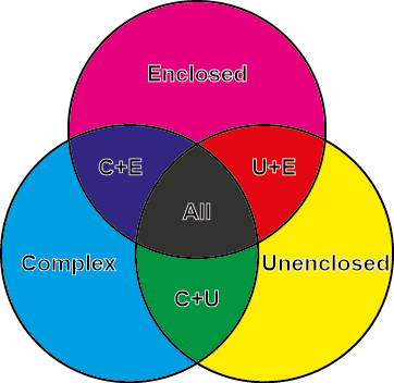
  • Cyan (turquoise) tones represent high values in Channel 1, e.g. “complex farmsteads” in the first example below.
  • Magenta tones represent high values in Channel 2, e.g. “enclosed farmsteads” in the first example below.
  • Yellow tones represent high values in Channel 3, e.g. “unenclosed farmsteads” in the first example below.
  • Blue tones represent high values in Channels 1 and 2.
  • Red tones represent high values in Channels 2 and 3.
  • Green tones represent high values in Channels 1 and 3.
  • Dark grey / black tones represent high values in all three Channels.
  • White or pale tones represent low values in all three Channels.

Here is a close up of the colour category zones for the first two examples below:

2 CMYK_RRSP

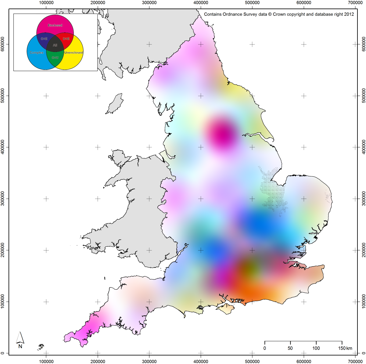
I began by examining the three main categories of Roman farmstead defined by the Roman Rural Settlement Project (RRSP) at Reading, using their excellent data that is available online (Allen et al. 2015). As they defined only three specific categories, this is an ideal dataset to map in this way. For a first attempt, I made three KDE layers using a 10km kernel (or search window) to structure the size of the clusters in the resulting output, then combined them as described above. When plotted against the regions defined based upon variation in their data by the RRSP team (Smith et al. 2016: Chapter 1), we can see that there is a degree of agreement between the regions and the clustering of particular colours:

1 RRSP_psychedelia_v3_inc_regions

However, there is also clearly considerably more complexity to the data than a simple regional classification might suggest (as the RRSP team would certainly acknowledge, so this is not intended as a criticism in any way). If we construct a new model using a wider kernel (in this case 50km), we can get a really nice sense of regional variation in the data without the need to draw lines on a map:

3 RRSP_psychedelia_v2

There is some interesting structure in this model. For example, one can see a focus on enclosed farmsteads in the north and west, so-called complex farmsteads in parts of the southern and eastern midlands (largely alongside enclosed farmsteads), with quite a different focus on enclosed and unenclosed farmsteads in the south east. The strong peak in enclosed farmsteads in south Yorkshire / the north midlands is also quite striking. Although it relies too much on good colour vision in a reader, I think this model and technique works quite well here, so I decided to apply it to another dataset: our own.

Before we get to the next stage, here is a close-up of the colour category zones for the next two maps (with RO = Roman; PR = Prehistoric; EM = early medieval):

5 CMYK_Englaid

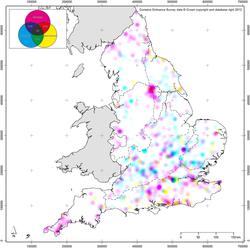
Based on another technique which we published recently (Green et al. 2017), the following two maps are created from a measure of the “complexity” of our datasets: specifically the number of different types of site / monument (based upon our thesaurus of types; see Portal to the Past) per 1x1km square. This measure was calculated for each square for each time period in our database and then density surfaces created for each time period (using a 5km kernel in this instance). A shortcoming of the mapping technique comes into play here: it can only map three categories at once. As such, we had to combine the Bronze Age and Iron Age models into a composite model for later prehistory. The three time period based complexity models were then combined into a single image as previously:

4 complexity_psychedelia_global

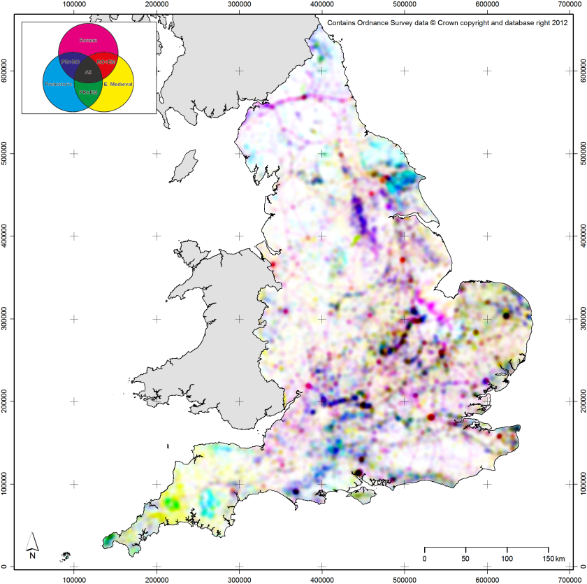
There are various nice patterns in this dataset, including the clear strength of prehistory and the early medieval in the south western peninsula, the intense focus on major river valleys (partly due to the large gravel quarry excavations in those areas), and the appearance of Roman roads highlighted in magenta. The Roman period also looks quite dominant generally, with lots of pinks, blues, and reds visible on the map. There is also a very clear difference in intensity between eastern / southern England and northern / western England.

It is possible to lessen the effects of regional and period based variation, by constructing a series of larger kernel density surfaces and using these to “correct” for regional variation in the period based models. This produces a new model which reflects complexity on a more local scale. Essentially, the first model can be thought of as a model of “globally” scaled (by which I mean the whole of the dataset, not the whole of the planet) complexity and the new model can be thought of as a model of locally scaled complexity:

6 complexity_psychedelia_local

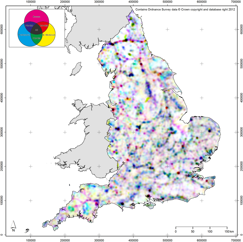
This model also shows some interesting patterns. It is much less dominated by single periods in particular regions, with Roman dominance mostly along the Roman roads and Hadrian’s Wall. There are also some nice dark areas, which show high levels of local complexity across all three time periods. These cluster mostly along rivers again or around the large Roman towns, along with a similar cluster in southern Yorkshire / the north Midlands to that seen in the RRSP data.

As with all models of English archaeology, the images presented here represent a very complex data history, being influenced by both where more (and more visible archaeologically) activity took place in the past and where more modern archaeological activity takes place in the present (largely driven by development). They also, as previously noted, come with considerable caveats in regards to legibility, due to the relatively large minority of people with restricted colour vision (c.8-10% of men, and maybe 1% of women). The technique is also restricted by its inability to map more than three variables, but more than three variables would probably overcomplicate matters even if it were possible. However, I hope that this post gives a sense of the variation and complexity in the English archaeological record, locally, regionally, and nationally.

EngLaId is now winding down, having officially ended at Christmas, so this will probably be the last substantive post on technique or data for a while. We will however announce here when any new publications come out, including our main books.

Chris Green

References:

Allen, M., T. Brindle, A. Smith, J.D. Richards, T. Evans, N. Holbrook, M. Fulford, N. Blick. 2015. The Rural Settlement of Roman Britain: an online resource. York: Archaeology Data Service. https://doi.org/10.5284/1030449

Green, C., C. Gosden, A. Cooper, T. Franconi, L. Ten Harkel, Z. Kamash & A. Lowerre. 2017. Understanding the spatial patterning of English archaeology: modelling mass data from England, 1500 BC to AD 1086. Archaeological Journal 174(1): p.244–280. http://www.tandfonline.com/doi/full/10.1080/00665983.2016.1230436

Smith, A., M. Allen, T. Brindle & M. Fulford. 2016. New Visions of the Countryside of Roman Britain. Volume 1: the Rural Settlement of Britain. Britannia Monograph Series No. 29. London: Society for the Promotion of Roman Studies.

EDIT: Since writing this blog post, Martin Sterry has published a paper on his visualisation techniques, which can be found here: https://doi.org/10.11141/ia.50.15

Mapping pottery

Following on from suggestions (primarily by Prof. Barry Cunliffe) at our Academic Advisory Board meeting last year, we started thinking about how we might map aceramic (or minimally ceramic-using) zones through our time period. Due their general commonness and generally diagnostic nature, ceramic finds are probably the most commonly used method for dating archaeological contexts and, thus, by extension sites as a whole. As such, in areas where ceramic objects were little used, it becomes more difficult (and probably more expensive) to date sites. This, in turn, is likely to result in sites in aceramic areas being less precisely dated. This could, therefore, bias the distribution of sites of a particular period in the archaeological record, as sites in aceramic zones within a particular period are less likely to be securely dated to that period.

However, actually mapping aceramic zones is not especially easy. To do so, one must first map areas where ceramics are used, and collating data on that scale for 2,500 years of human history would almost certainly be a research project in itself on a similar scale to EngLaID as a whole. Therefore, we had to try and obtain the results of previous attempts at pottery synthesis.

We began with prehistory. The only existing national database which we could find of later prehistoric (Later Bronze Age to the Roman conquest) pottery was that created by Earl et al. (2007), archived at the ADS. The data collection for that project took place in 1995-6, so it is almost twenty years out of date, but it was the only reasonably comprehensive data source available to us. We hope that the broad brush picture will have not changed substantially in the past twenty years (albeit see below for the early medieval period), but until another such project is undertaken it is impossible to be certain.

1 earl_pot_density_ALL
Density of later prehistoric pottery records

Simply plotting the density of records in this database shows a distinct bias in the distribution of later prehistoric pottery towards the southern and eastern half of England (essentially, Cyril Fox’s “lowland” zone of Britain), with the exception of a notable lack of pottery in the Weald and on the South Downs, and small peaks of pottery in western Cornwall, East Yorkshire, and County Durham. North Devon and large swathes of the West Midlands and the north west show a distinct lack of ceramic usage (or at least recovery by archaeologists).

2 earl_pot_density_phased
Density of LBA to EIA vs MIA to Conquest period pottery records

We can nuance this picture slightly by looking at change over time.  Following discussion with the prehistoric experts on the team, I split the data temporally into two broad time periods: Late Bronze Age to Early Iron Age, and Middle Iron Age to the conquest. The pattern that results seems to show a movement (of the peak in density) away from Wessex and northwards into the East Midlands, which could be the result of any number of factors (population growth, environmental change, etc.).

3 earl_pot_density_UnspecPrehist
Density of unspecified prehistoric pottery records

However, there are also large numbers of unspecified later prehistoric records in the database (especially in East Anglia), so temporal patterns should not be too heavily emphasised.

4 earl_pot_sherdcount_ALL_overEI
Sherdcounts of prehistoric pottery over density of prehistoric records in EH’s Excavation Index

Many of the records in the database also record sherd counts of the assemblages recorded, which helps to nuance the picture further. In an attempt to see if the patterns produced when mapping the database records simply stemmed from where archaeological work takes place (which inevitably they must to some extent), I mapped the records against the density of later prehistoric events recorded in English Heritage’s Excavation Index. As the map above shows, there does appear to be a fairly strong correlation. However, there are low peaks in the density of events in the north west which are not represented in the pottery database, so the pattern is not entirely determined by modern archaeological practice.

5 earl_pot_sherdcount_ALL_over14Cprob
Sherdcounts of prehistoric pottery over modeled radiocarbon probability for same period

To take this further, I also mapped the sherd counts against a modeled surface of radiocarbon probabilities for the same period (see previous post). This seems to show that there are areas of relatively high radiocarbon probability in apparently aceramic zones, suggesting that activity was taking place in those areas at that time. This helps to suggest that our aceramic zones, although partially biased by patterns of modern archaeological practice, are reasonably likely to be real. For later prehistory, then, it does appear that there was less use of pottery in the north west, the West Midlands, and in north Devon.

Moving on to the Roman period, the best source of national level data which we could find is Paul Tyers’ excellent Potsherd website. Naturally, collating sherd count level data for the Roman period would be an immense task (due to the incredible amount of ceramics deposited on Roman sites): as such, Tyers maps pottery by ware type on a presence / absence basis (by 10x10km square). His maps are all dated 2004, so we assume that the data mapped is around ten years out of date. Again, it is assumed that broad brush patterns will not have changed immensely, although proving that would be difficult.

Tyers provides encyclopaedic detail on his website, but does not offer direct downloads of his data. Fortunately, his maps are all relatively high resolution and all constructed in the same way, so it is possible to perform various trickery on them in order to study them further in GIS. It then becomes feasible to sum Tyers’ maps together and produce a map of variability in pottery wares across Romano-British England. As such, this is not directly comparable with the later prehistoric maps discussed above, as we are mapping the number of different ceramic wares deposited across England for the Roman period, rather than the density of records (i.e. site assemblages) for prehistory.

6 tyers_ware_density
Roman pottery variability

The map above shows the overall variability in Roman pottery across England, based on Tyers’ data. Dark blue areas have no pottery (the aceramic zones we sought) and red areas have many different types of pottery. The results are quite interesting: the greatest variability in pottery wares is in a similar region to the greatest density of later prehistoric pottery records, i.e. in the south and east of England. However, the zone covered is significantly larger and there are also further significant peaks in otherwise “quiet” areas, particularly around the Roman cities and military sites.

7 tyers_ware_density_domestic_imported
Roman pottery variability: domestic vs imported

We can, however, take this further. Comparing variability in domestic and imported wares, we can see that the areas with greatest variety in imports were around the major settlements and, in particular, around the Thames estuary. By contrast, the greatest variability in domestic wares was more widespread.

8 tyers_ware_density_coarseware
Roman pottery variability: coarsewares
9 tyers_ware_density_fineware
Roman pottery variability: finewares
10 tyers_ware_density_terrasigilata
Roman pottery variability: terra sigilata / Samian ware
11 tyers_ware_density_mortaria
Roman pottery variability: mortaria
12 tyers_ware_density_amphorae
Roman pottery variability: amphorae

Further patterns emerge when looking at more specific groups of wares. Coarsewares are quite well spread; finewares largely restricted to the south; terra sigilata is very clustered; mortaria are well spread and possibly rural in character; amphorae are very tightly clustered into small areas.

13 tyers_ware_density_overtime
Roman pottery variability: over time (smaller version here for tablets etc.)

We can also look at change over time, which also shows some interesting patterns, with the peak of variability being most widespread (albeit largely southern) in the 3rd and 4th centuries. The strong 5th century peak in Cornwall is caused by imported wares from the eastern Mediterranean.

Overall, the patterns produced by mapping Tyers’ data in this way can potentially tell us interesting things about pottery supply in the Romano-British period, in particular in regard to economic factors (as availability of different ceramic wares must be linked to economic conditions / opportunity to some extent). Also, although we have mapped somewhat different things, certain comparisons can be made with the later prehistoric data: areas with less ceramics in the Romano-British period were less widespread than in later prehistory, but in generally the same places, especially if you mentally factor out the influence of military garrisons.

14 Vince_Blinkhorn_C9_pot
9th century AD pottery industries (after Vince 1993; Blinkhorn and Dudd 2012)

Moving finally to the early medieval period, we struggled to find any datasets of anything like the degree of comprehensiveness of either the Earl et al. or Tyers data. The best source discovered was a fairly old article by Alan Vince (1993), which mapped the major pottery industries of the 9th century AD. However, it does appear that this map was now quite out of date, as his zone of Ipswich Ware (highlighted in red above) was much more restricted than the areas recorded recently by Blinkhorn (2012) (black dots and shaded in grey: it is assumed that the grey shading is record density by modern administrative region, but the map had no legend). This also only really covers the very end of our period, when wheel thrown pottery came back into production in England: we have no data for the mid-5th to 8th centuries. As such, it is hard to draw any conclusions at all about the early medieval picture.

In conclusion, largely aceramic zones probably existed in later prehistory in the north west, the West Midlands and the south west. These largely persisted into the Roman period, albeit with ceramic using areas around the military installations and larger settlements. In the early medieval period, we do not have enough data to reach even tentative conclusions, but we might assume that the same areas continued to use less pottery than in the south and east? Or that might be plain conjecture.

Chris Green

References:

Blinkhorn, P. 2012. The Ipswich Ware Project: Ceramics, Trade and Society in Middle Saxon England. Medieval Pottery Research Group Occasional papers.

Earl, G., E. Morris, S. Poppy, K. Westcott, T.C. Champion. 2007. Later Prehistoric Pottery Gazetteer. http://dx.doi.org/10.5284/1000013

Tyers, P.A. 2014. Potsherd. http://potsherd.net/atlas/potsherd

Vince, A. 1993. “Forms, Functions and Manufacturing Techniques of Late Ninth- and Tenth- Century Wheelthrown Pottery in England and their Origins.” In D. Piton (ed.), Travaux du Groupe de Recherches et D’Etudes sur la Céramique dans le Nord – Pas-de-Calais; Actes du Collque D’Outreau (10 -12 Avril 1992). Numéro hors-série de Nord-Ouest Archéologie, pp.151-64.

Addendum – 12/01/2015:

In an attempt to see if the aceramic zone in the north of England in later prehistory was genuine or an artefact of modern archaeological practice, we mapped hillfort excavations prior to 1997 recorded in English Heritage’s Excavation Index (mapped as green diamonds) against hillfort ceramic assemblages recorded by Earl et al. (up to 1996). The results do appear to show that, on the whole, hillfort excavations do produce pottery in the southern half of England, but largely do not in the northern half, with the notable exception of northern Northumberland. This suggests that this is likely to be a genuine aceramic zone:

15 earl_pot_sherdcount_Hillforts_overEI
Hillfort excavations recorded in EH’s Excavation Index (pre-1997) against hillfort ceramic assemblages