
This week, in an attempt to avoid any substantive work, I have been playing around with the Ordnance Survey’s Digital Terrain Models (DTM) that are available for free as part of their OpenData archive to anybody who wishes to use them. The spur for this was the launch in July of a new DTM onto the OpenData site.
Previously (and still today), the OS made available a dataset known as PANORAMA. This was created using contour data surveyed in the 1970s. In order to turn this into a rasterised DTM, some interpolation algorithm (I don’t know which) was used to estimate elevation values between contours to result in a continuous field (50m by 50m pixels) of elevation values for all of the UK. The heights in PANORAMA are recorded as integers, i.e. to the nearest whole metre.
In July, the OS released a new product, known as Terrain 50. This DTM was created using LiDAR data surveyed from the air and then averaged out to 50m by 50m grid cells. A lot of data processing goes into turning raw LiDAR data into a terrain model, but this all takes place behind the scenes, so it is difficult to know exactly what has been done. The heights in Terrain 50 are recorded as floating point numbers, so apparently convey more precision than PANORAMA. However, due to the relatively coarse nature of the grid used (50m by 50m pixels), this does carry a degree of spurious accuracy (as we are inevitably dealing with averages).
This map shows both products for comparison (click to enlarge):

Certain things stand out when you compare these images, but more obviously when you look at the hillshade (click to enlarge):

The main things to note are:
- The contour origin and whole number data model of PANORAMA produces a stepped plateau appearance, being especially apparent in areas of gradual change in elevation.
- PANORAMA produces a substantially smoother picture of change in elevation over space.
- Terrain 50 appears much more accurate, but also “noisy”.
- Human impacts on the landscape (e.g. quarrying) show up much more obviously in Terrain 50.
On the face of it, Terrain 50 looks a much more accurate representation of the terrain of the UK and, as such, would likely be most peoples’ first choice when choosing between these two DTMs.
As I have so far been working with the PANORAMA DTM, I wanted to test how different it was from Terrain 50 in order to see if I should go back and rerun some of my analyses with the newer product. The simplest way to do this is to compare the elevation values recorded in each product for the same piece of terrain, i.e. subtract one grid from the other in the Raster Calculator in ArcGIS and then calculate some basis statistics on the result.
However, this is complicated somewhat by the fact that the two grids are not aligned directly on top of each other: the origin of a pixel in one is in the middle of a pixel in the other, i.e. they are offset by 25m east / west and 25m north / south. To enable a direct comparison to be made, I reprocessed the PANORAMA DTM to split each cell into four and then aggregated sets of four cells (using the mean) on the same alignment as Terrain 50. This will have resulted in some smoothing of the resulting surface, I expect, but hopefully not to the extent of making the comparison invalid (as PANORAMA already possessed a relatively smooth surface).
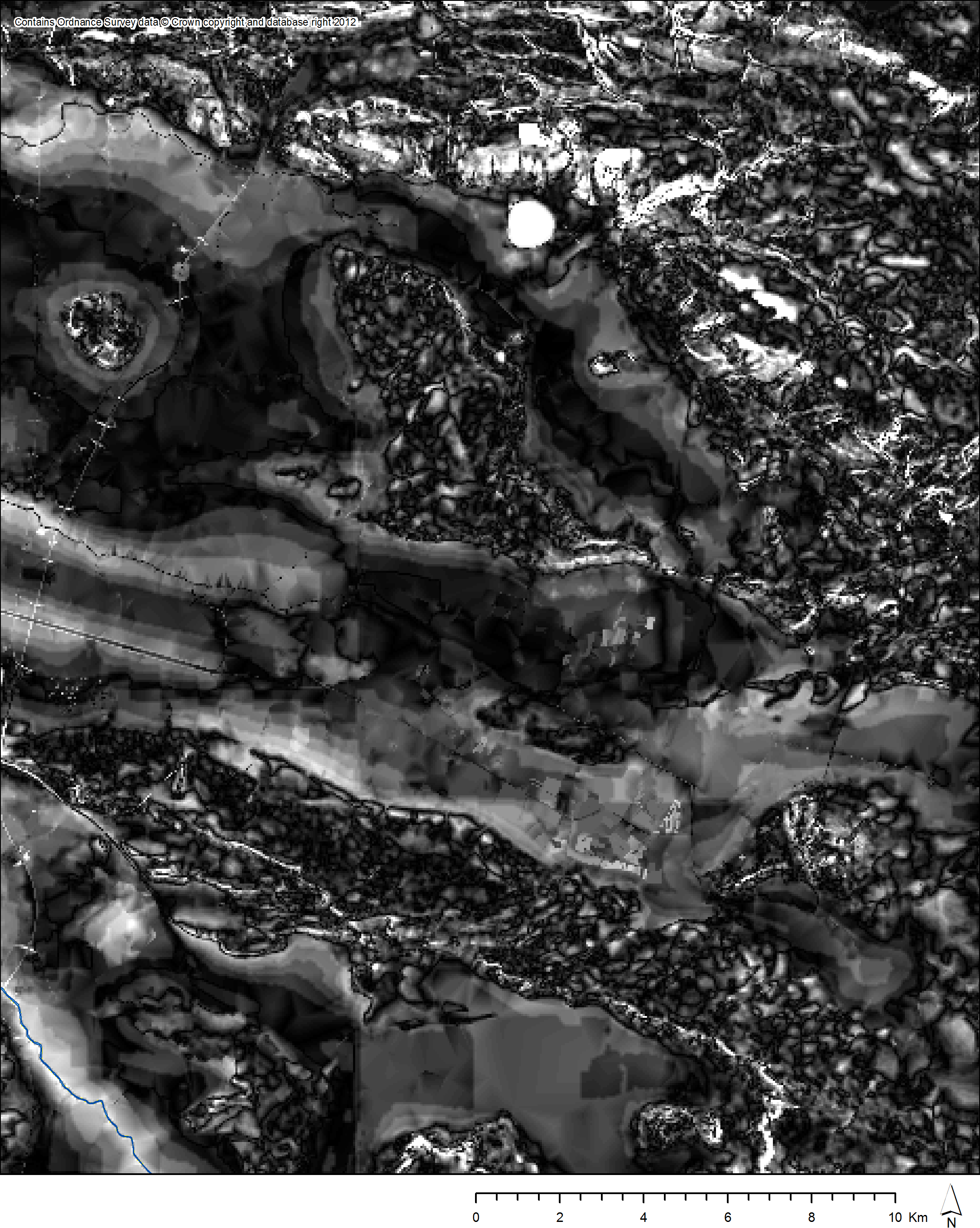
The results can be seen on this map (click to enlarge):

White cells show little difference. Yellow cells are slightly higher elevation in Terrain 50 and red cells are significantly higher. Cyan cells are slightly higher elevation in PANORAMA and blue cells are significantly higher. Certain things stand out on this map:
- Differences between the two DTMs are greatest in upland areas. This will at least partly be due to the need to draw contours legibly forcing cartographers to underplay the steepness of very steep slopes.
- The sea tiles are quite interesting in the way they vary. This seems to be due to PANORAMA using a single value for sea cells across the whole dataset, whereas Terrain 50 seems to use a single value for sea cells on each 10km by 10km tile, but different values between tiles.
- We can also see some differences being much greater on one side or other of the division between tiles aligning with 1000m divisions on the OS grid. This must be due to Terrain 50 data being processed on a tile by tile basis, more on which later.
Overall, however, the differences between the two DTMs are not great. If we remove the negative sign from the difference layer (by squaring, then square rooting the result) and clip out sea cells, we can plot a histogram of the difference in elevation (across all 92 million cells):

From this graph, we can see that although there are cells with differences of up to nearly 230m, the vast majority of cells are within 5m of elevation of their counterpart. The mean difference is 1.91m and the standard deviation 2.26m; 75% of all values are within 2.5m of their counterpart. As such, PANORAMA and Terrain 50 are actually very similar in elevations recorded.
We can also plot this difference layer on a map, with some interesting results:
Black cells on this map show no difference or minimal difference, shading up through grey to white for cells of relatively high difference in elevation between the two DTMs. Certain features stand out, some of which I have annotated onto this map:

The motorway is clearly a feature that appears in Terrain 50 but not PANORAMA. The contour lines are clearly an artifact of the origins of PANORAMA. The reservoir is presumably a similar issue to the sea level variation. The variation on the Mendips is presumably due to the “noisier” more precise nature of Terrain 50 contrasting against the smoothed appearance of PANORAMA.
The appearance of the grid lines worries me somewhat though. They were not apparent (to my eye) when looking at the raw data or hillshade layers for either dataset, so presumably they are the result of quite a subtle effect. My assumption (as mentioned above) is that these arise from the LiDAR data behind Terrain 50 being processed as a series of tiles rather than as a single dataset: this is of course inevitable as a continuous high resolution LiDAR dataset for all of the UK would be mind bogglingly immense. My fear is that any sensitive analyses of terrain using Terrain 50 might show up these grid edges in their results. However, this is even more true of the 1m contour “cliff edges” that appear in PANORAMA. At least grid lines will be obvious to the human eye if they do cause strange effects.
So, what does this all mean? Well, I would argue that the generally minimal difference between elevations recorded for the same place in the two datasets means that previous analyses (especially coarse analyses) undertaken using PANORAMA should not be considered invalidated by the (presumably) more accurate new Terrain 50 DTM. Also, the “noisy” nature of Terrain 50 and the presence therein of more features of human origin might mean that the smoother PANORAMA could still be the best choice of DTM for certain applications (especially in archaeology, where features like the M5 would not generally be a useful inclusion).
Chris Green

Thank you very much for your comparison. At ,,Difference between PANORAMA and Terrain 50 cells” map I would like more scientific (precise) description than: little, slightly and significantly.
Hi Pawel,
Thanks for your comment.
This was just a little experiment to see how the two DEMs compared, without any great amount of work put into it or rigorous statistical testing of the results, as that would be too much effort to put into something fairly tangential to my work. The only figures I calculated are in the following paragraph from the original post:
“From this graph, we can see that although there are cells with differences of up to nearly 230m, the vast majority of cells are within 5m of elevation of their counterpart. The mean difference is 1.91m and the standard deviation 2.26m; 75% of all values are within 2.5m of their counterpart.”
My tendency would be to leave it up to more rigorous spatial statisticians to undertake any more thorough / quantified comparisons of the two DEMs, as it would involve more work than I am willing to put into it!
Chris